library(tidyverse)
library(sf)Data Visualization
Important
All data, figures, and analyses are intended for educational purposes only and should not be used for decision-making, and have been adjusted or simulated to protect sensitive information. Do not use outputs from this project outside of the educational context!
Step 1 - Load Libraries
Step 2 - Load Data
dat <- read_csv("material/data/processed/df_malaria_cleaned_DRC_hsv.csv")Rows: 1189584 Columns: 8
── Column specification ────────────────────────────────────────────────────────
Delimiter: ","
chr (5): province, district, health_facility, hfid, data_type
dbl (2): value, value_corrected
date (1): period
ℹ Use `spec()` to retrieve the full column specification for this data.
ℹ Specify the column types or set `show_col_types = FALSE` to quiet this message.Step 3 - Check the variables you have, is anything missing? Are the names clear? missing geo data, will add on later
names(dat)[1] "province" "district" "health_facility" "hfid"
[5] "data_type" "period" "value" "value_corrected"glimpse(dat)Rows: 1,189,584
Columns: 8
$ province <chr> "Bas Uele", "Bas Uele", "Bas Uele", "Bas Uele", "Bas U…
$ district <chr> "Aketi", "Aketi", "Aketi", "Aketi", "Aketi", "Aketi", …
$ health_facility <chr> "CHW_00052", "CHW_00052", "CHW_00052", "CHW_00052", "C…
$ hfid <chr> "D0TTBA", "D0TTBA", "D0TTBA", "D0TTBA", "D0TTBA", "D0T…
$ data_type <chr> "malaria_death", "malaria_death", "malaria_death", "ma…
$ period <date> 2023-01-01, 2023-02-01, 2023-03-01, 2023-04-01, 2023-…
$ value <dbl> 0, 0, 0, 0, 0, 0, 0, 0, 0, 0, 0, 0, 0, 0, 0, 0, 0, 0, …
$ value_corrected <dbl> 0, 0, 0, 0, 0, 0, 0, 0, 0, 0, 0, 0, 0, 0, 0, 0, 0, 0, …Step 4 - Make a filtered dataset for 2024 Severe Malaria
table(dat$data_type)
 malaria_death severe_malaria
        594792         594792
dat_24 <- dat %>%
filter(lubridate::year(period) == 2024,
data_type == "severe_malaria")Step 5 - Ensure data are in long format for age group disaggregation
head(dat_24)# A tibble: 6 × 8
province district health_facility hfid data_type period value
<chr> <chr> <chr> <chr> <chr> <date> <dbl>
1 Bas Uele Aketi CHW_00052 D0TTBA severe_malaria 2024-01-01 23
2 Bas Uele Aketi CHW_00052 D0TTBA severe_malaria 2024-02-01 0
3 Bas Uele Aketi CHW_00052 D0TTBA severe_malaria 2024-03-01 13
4 Bas Uele Aketi CHW_00052 D0TTBA severe_malaria 2024-04-01 30
5 Bas Uele Aketi CHW_00052 D0TTBA severe_malaria 2024-05-01 58
6 Bas Uele Aketi CHW_00052 D0TTBA severe_malaria 2024-06-01 11
# ℹ 1 more variable: value_corrected <dbl>Step 6 - Aggregate to the Province Level and summarize totals by period
dat_24_prov <- dat_24 %>%
  group_by(province, period) %>%
  summarise(total_severe = sum(value_corrected, na.rm = TRUE))
`summarise()` has grouped output by 'province'. You can override using the
`.groups` argument.Step 7.1 - Make a stacked bar plot of severe malaria cases per province by month Do the aesthetics of the plot (type size, theme, colors) support readability and attention? How can we visualize 20+ colors at the same time?
provs = unique(dat_24$province)Load the RColorBrewer package so we can access more exciting color palettes
library(RColorBrewer)Classic palette BuPu, with 4 colors
coul <- brewer.pal(4, "Dark2") But we have 26 provinces, so we need to add more colors to this palette: the colorRampPalette function interpolates colors to increase the number available in a given palette.
coul <- colorRampPalette(coul)(26)Let’s make the stacked bar plot, with geom_col()
dat_24_prov %>%
  ggplot() +
  geom_col(aes(x = period, y = total_severe, fill = province),
           stat = "identity") +
  theme_minimal() +
  scale_y_continuous(labels = scales::label_number(big.mark = ",")) +
  scale_fill_manual(values = coul,
                     breaks = provs) +
  labs(x = "Month", y = "Total Severe Malaria Cases", fill = "Province") +
theme(text = element_text(size = 14)) 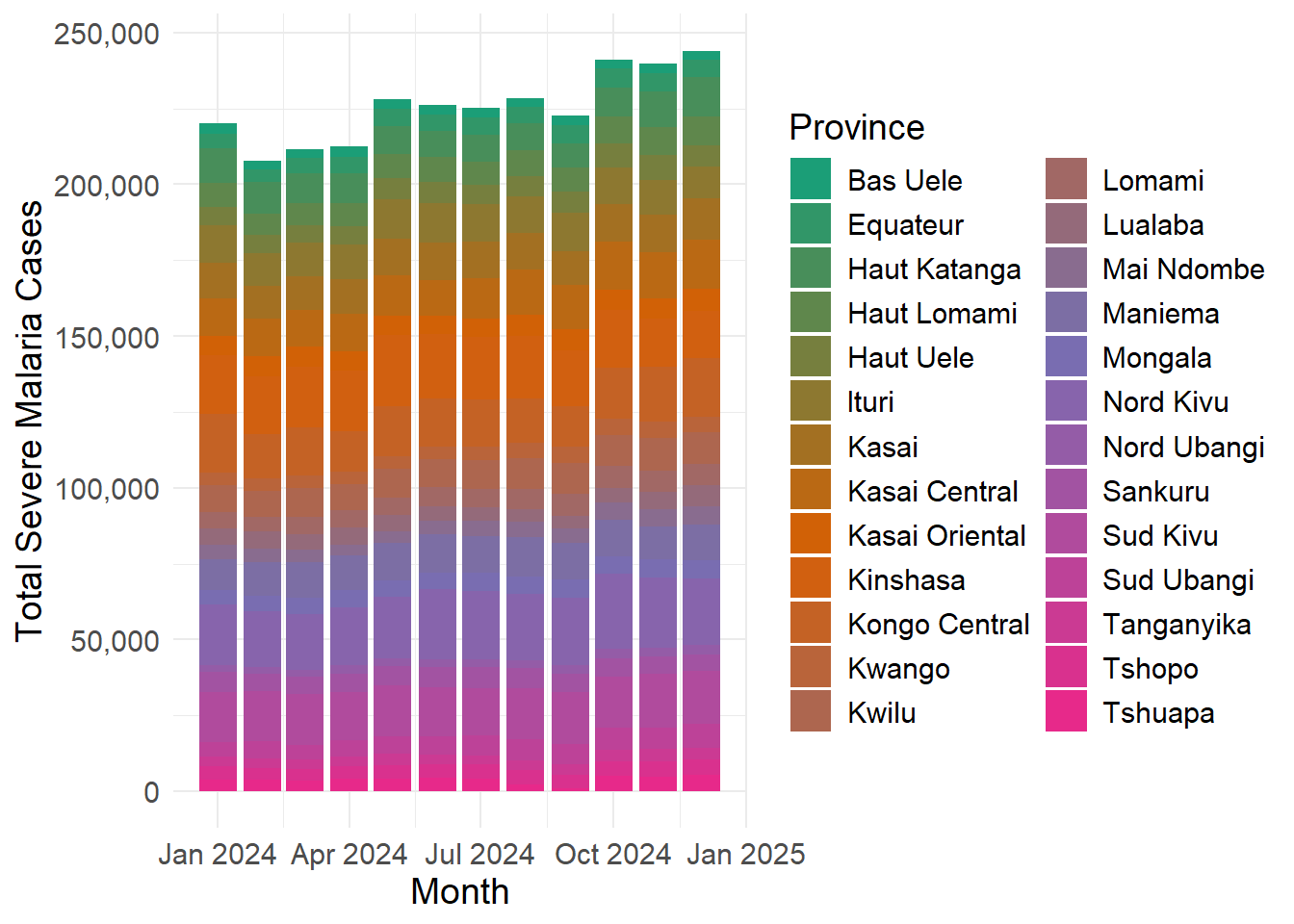
Step 7.2 - Is this plot informative? Would a different kind of plot be more appropriate? Use the position = “dodge” argument to try another type of bar char.
dat_24_prov %>%
  ggplot() +
  geom_col(aes(x = period, y = total_severe, fill = province),
           position = "dodge") +
  theme_minimal() +
  scale_y_continuous(labels = scales::label_number(big.mark = ",")) +
  scale_fill_manual(values = coul,
                    breaks = provs) +
  labs(x = "Month", y = "Total Severe Malaria Cases", fill = "Province") +
  theme(text = element_text(size = 14),
legend.position = "bottom") 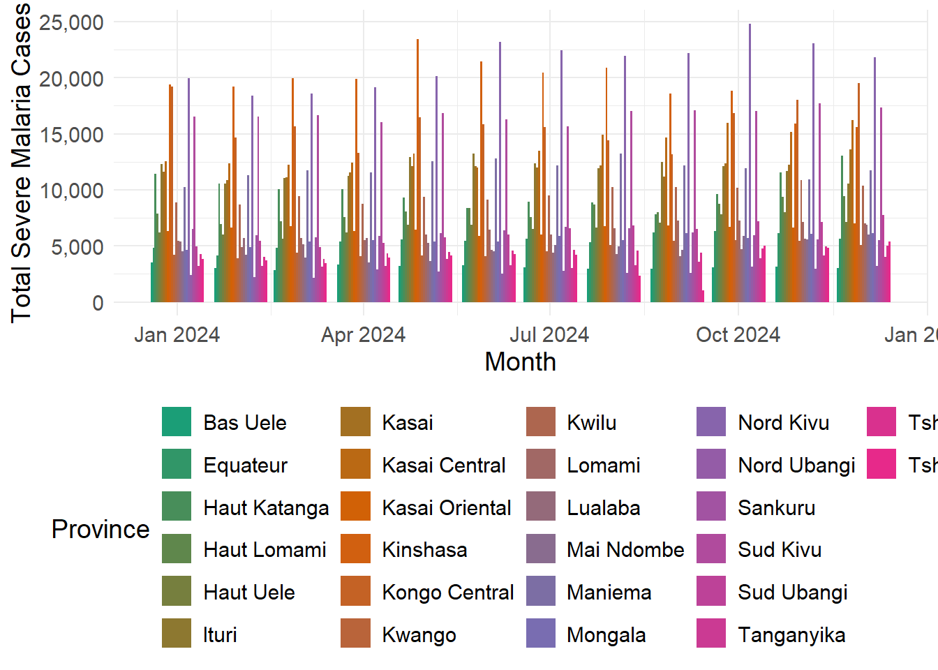
Step 7.3 - Can we really get much information out of this? When there is so much data it can be best to use a faceted approach with the facet_wrap() command.
dat_24_prov %>%
  filter(year(period) == 2024) %>%
  ggplot() +
  geom_col(aes(x = period, y = total_severe, fill = province),
           position = "dodge") +
  scale_fill_manual(values = coul,
                    breaks = provs) +
  theme_minimal() +
  labs(x = "Month", y = "Total Severe Malaria Cases", fill = "Province") +
  theme(text = element_text(size = 14),
        axis.text.x = element_text(angle = 45, hjust = 1, size = 12),
        legend.position = "none") +
  facet_wrap(vars(province))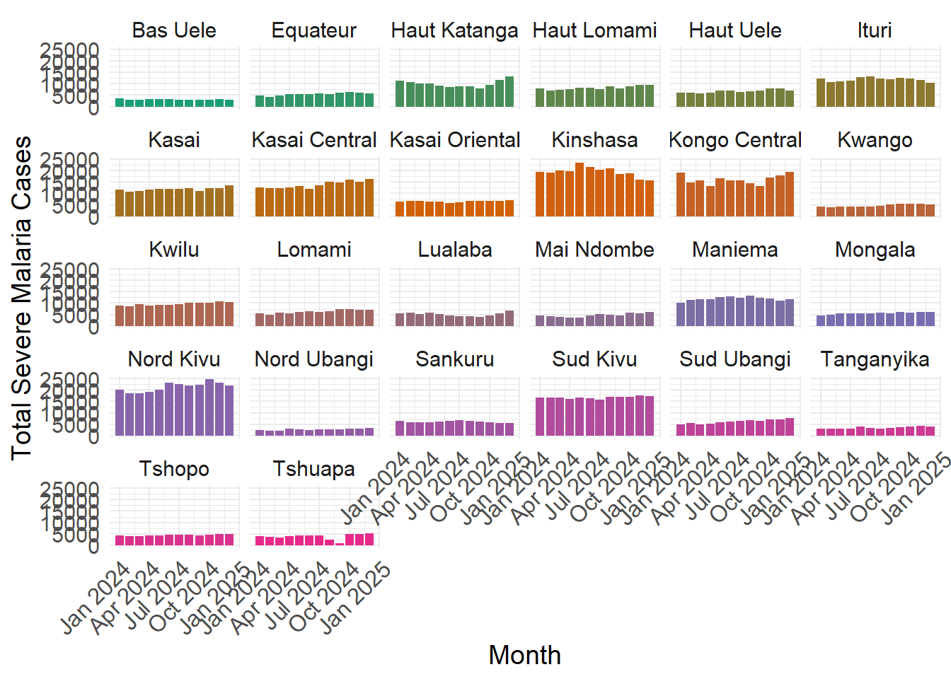
Step 9 - Use the original dataset (unfiltered) to make a time series line plot Of severe malaria data from Jan 2023 - December 2024
First let’s summarise to the province level to look at overall trends, and let’s also include a variable for facility type that we will need to create by using the separate() function to split our facility_name variable apart. Give separate() the following arguments. col(the name of the variable you want to split), into(“two new variable names for the data to be split into”), and sep(“the character we will use to split the data”)
What concerns do you have from looking at these data?
What follow-up steps/analyses would you take?
dat_severe <- dat %>%
  filter(data_type == "severe_malaria") %>%  separate(col = health_facility, into = c("type", "id_num"), sep = "_")
Hint separate isn’t a tidyverse function, but you can also use str_split() instead. Don’t know str_split()? Google the function, see if you can figure out how to use it.
dat_severe %>%
  group_by(period, province, type) %>%
  summarise(total_severe = sum(value, na.rm = TRUE)) %>%
  ungroup() %>%
  ggplot() +
  #'a common error in line plots comes from failing to group properly
  #'if your lines look very spiky and disconnected, try using group = "var"
  geom_line(aes(x = period, y = total_severe, color = type)) +
  theme_minimal() +
  labs(x = "Month", y = "Total Severe Malaria Cases", color = "Facility Type") +
  theme(text = element_text(size = 14),
        axis.text.x = element_text(size = 10),
        legend.position = "none") +
  scale_x_date(date_breaks = "1 year",date_labels = "%Y") +
  scale_color_viridis_d() +
  facet_wrap(vars(province))
`summarise()` has grouped output by 'period', 'province'. You can override
using the `.groups` argument.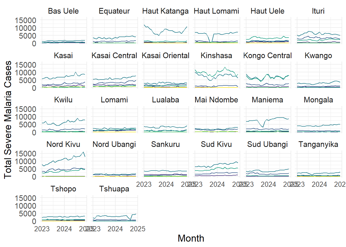
Step 10 - Next, make a faceted version visualizing each district within a province individually.
How can we best display so many data points visually?
What kinds of inference can you derive from this plot about malaria burden in DRC?
Do any of the health zones strike you as unusual or suspicious?
dat_severe %>%
  filter(province == "Bas Uele") %>%
  group_by(period, district, type) %>%
  summarise(total_severe = sum(value, na.rm = TRUE)) %>%
  ungroup() %>%
  ggplot() +
  geom_line(aes(x = period, y = total_severe, color = type)) +
  theme_bw() +
  labs(x = "Month", y = "Total Severe Malaria Cases", color = "Facility Type") +
  scale_x_date(date_breaks = "1 year",date_labels = "%Y") +
  theme(text = element_text(size = 14)) +
  facet_wrap(vars(district))
`summarise()` has grouped output by 'period', 'district'. You can override
using the `.groups` argument.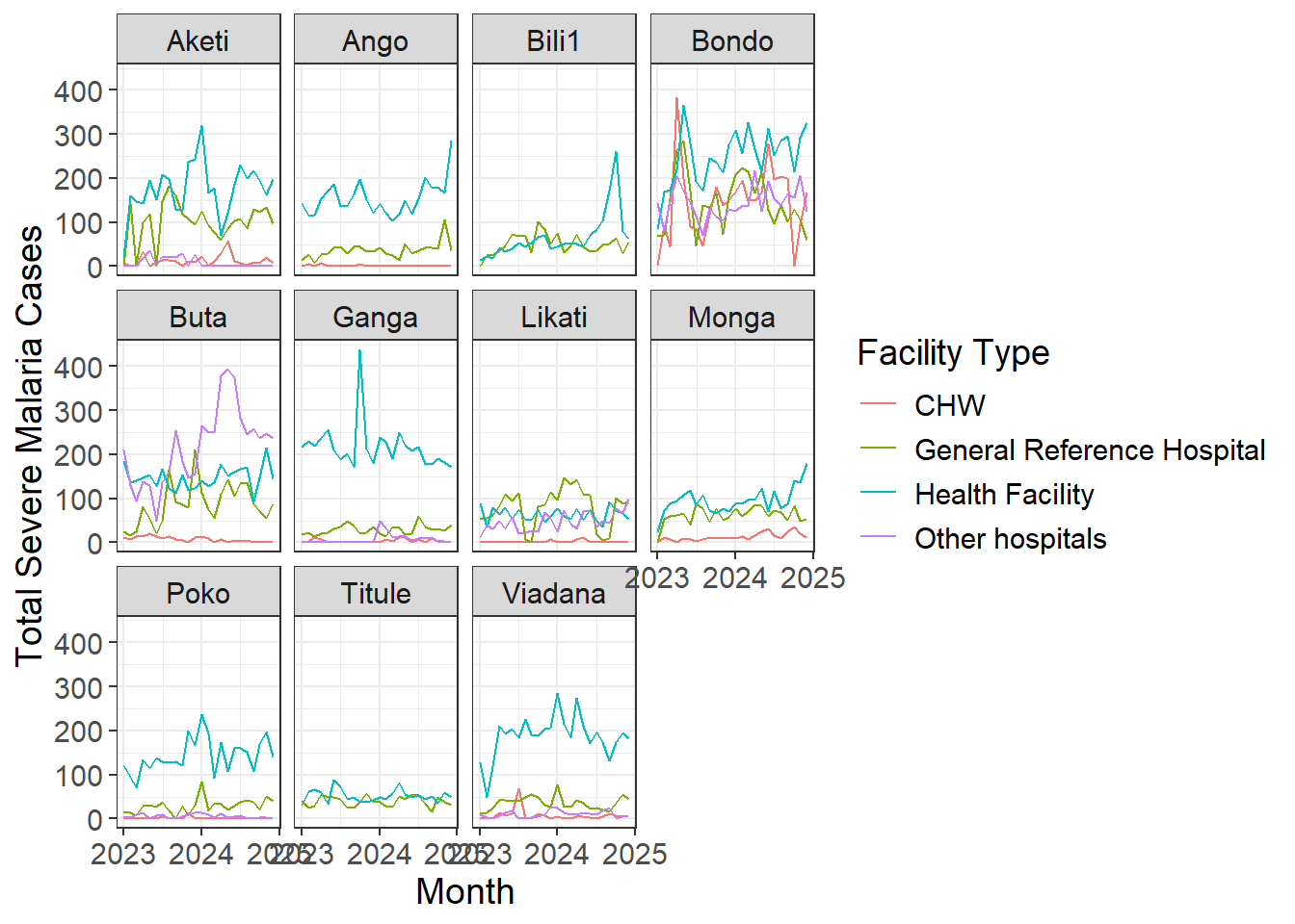
Repeat the same process to visualize individual facilities within a suspicious district.
dat_severe %>%
  filter(province == "Bas Uele",
         district == "Ganga") %>%
  group_by(period, hfid, type) %>%
  summarise(total_severe = sum(value, na.rm = TRUE)) %>%
  ungroup() %>%
  ggplot() +
  geom_line(aes(x = period, y = total_severe, color = type)) +
  theme_bw() +
  labs(x = "Month", y = "Total Severe Malaria Cases", color = "Facility Type") +
  scale_x_date(date_breaks = "1 year",date_labels = "%Y") +
  theme(text = element_text(size = 14)) +
  facet_wrap(vars(hfid))
`summarise()` has grouped output by 'period', 'hfid'. You can override using
the `.groups` argument.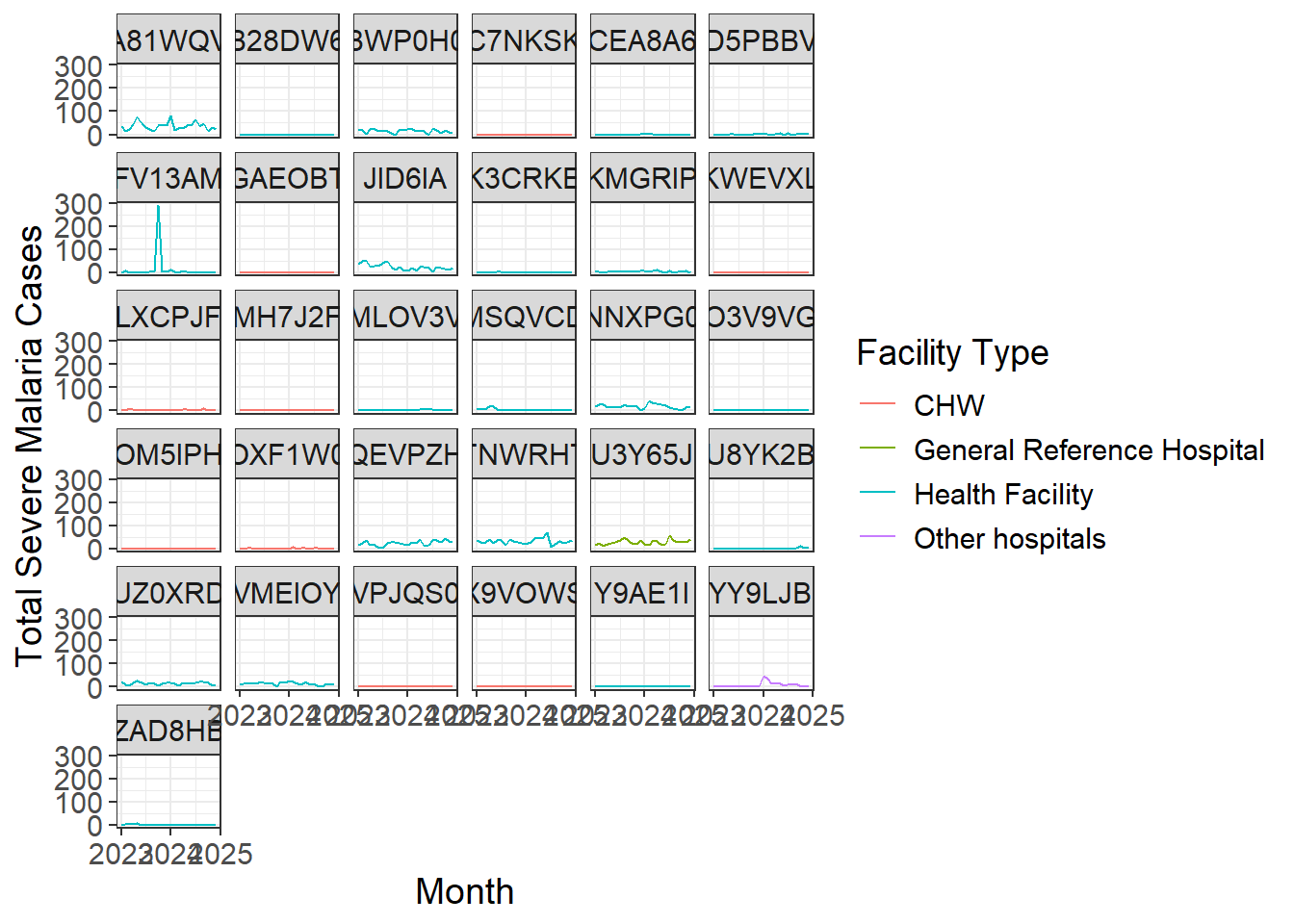
Step 11 - Make a Heatmap of total severe cases for Haut Lomami, with the y axis being district, and the x axis being period.
We will use the geom_tile() function to build our heatmap once the data have been filtered and aggregated to the proper level. Use the fill aesthetic to add color to the geom_tile() function.
What do you notice about the plot? Are any particular districts or months suspicious?
dat_severe %>%
  filter(province == "Haut Lomami") %>%
  group_by(district, period) %>%
  summarise(total_severe = sum(value_corrected, na.rm = TRUE)) %>%
  ungroup() %>%
  ggplot(aes(x = period, y = district)) +
  geom_tile(aes(fill = total_severe)) +
  labs(title = "Severe Malaria Cases per District in Haut Lomami (DRC), 2023-2024",
       x = "Period", y = "District", fill = "Severe Malaria Cases" ) +
  scale_fill_viridis_c(na.value = "grey90",
                       option = "magma", direction = -1,
                       breaks = scales::breaks_pretty(n=5)) +
  theme_minimal() +
  theme(plot.title = element_text(hjust = 0.5, face = "bold", size = 16),
        panel.grid.major.x = element_blank(),
        #'axis.text.y = element_blank(),
        axis.text.x = element_text(angle = 45, hjust = 1, size = 10),
        legend.position = "bottom")
`summarise()` has grouped output by 'district'. You can override using the
`.groups` argument.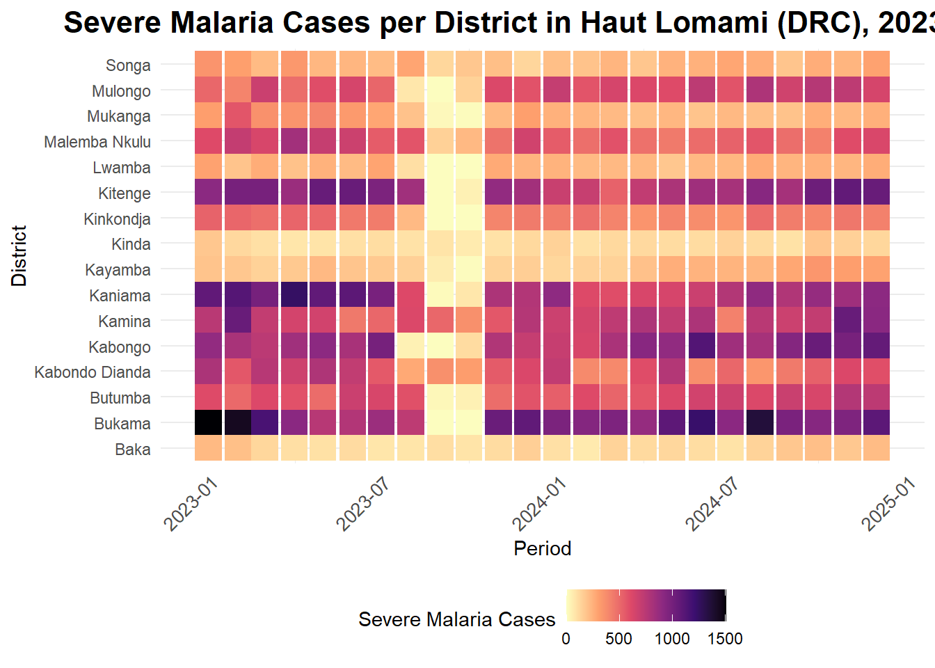
Here is a function from Justin that we can use for estimating population over multiple years when we only have one year of data to work from (as in our DRC shapefile). The value for growth rate was chosen because on average DRC has had a 3.3% growth over last 3 years.
scale_pop_growth_annual <- function(initial_pop, new_year,
                                    initial_year = 2024, growth_rate = 1.033) {
  pop_offset <- growth_rate^(new_year - initial_year)
  out <- initial_pop * pop_offset
  return(out)
}
Now we can read in our cleaned DRC shapefile for population and geometries columns.
drc_shp_join_new <- readRDS("material/data/processed/drc_hz_shapefile_pop.RDS")In order to join onto this, we need a district/health-zone-level summary dataset, because that is the most disaggregated unit available in the shapefile.
dat_severe <- dat %>%
  filter(data_type == "severe_malaria")

hz_severe <- dat_severe %>%
  group_by(year = lubridate::year(period), province, district) %>%
  summarise(total_severe = sum(value_corrected, na.rm = TRUE)) %>%
  ungroup()
`summarise()` has grouped output by 'year', 'province'. You can override using
the `.groups` argument.Now that the two datasets are on equal levels of analysis, we can use left_join() to join the two for geo-referencing and population calculations.
After the join, we will have all the information we need to create a new variable in our dataset, called severe_per_thousand. This is a more informative option than just plotting the total number of severe cases per district, because this will be based on population. To create the variable, divide the total number of severe cases by the district population, and then multiply by 1,000.
geo_dat <- hz_severe %>%
  left_join(drc_shp_join_new, by = c("province", "district" = "health_zone")) %>%
  mutate(population = scale_pop_growth_annual(initial_pop = as.numeric(pop_final),
                                              initial_year = as.numeric(pop_year),
                                              new_year = year),
         severe_per_thousand = round((total_severe/population) * 1000, 2)) %>%
  filter(!is.na(severe_per_thousand)) %>%
  mutate(severe_per_thousand_cut = case_when(severe_per_thousand < 15 ~ "0-15",
                                             severe_per_thousand >= 15 &
                                               severe_per_thousand < 35 ~ "15-35",
                                             severe_per_thousand >= 35 &
                                               severe_per_thousand < 60 ~ "35-60",
                                             severe_per_thousand >= 60 &
                                               severe_per_thousand < 90 ~ "60-90",
                                             severe_per_thousand >= 90 ~ ">90"),
         severe_per_thousand_cut = factor(severe_per_thousand_cut,
                                          levels = c("0-15", "15-35", "35-60",
                                                     "60-90", ">90"))) %>%
  dplyr::select(-c(pop_year, pop_final, id_519, adm2_id))
To plot geographic data on a map, we will use the geom_sf() command, including an argument for the fill() aesthetic to create a colored chloropleth with our calculated severe_per_thousand variable, faceted by Year.
geo_dat %>%
  ggplot() +
  geom_sf(aes(fill =severe_per_thousand, geometry = geometry)) +
  facet_wrap(vars(year)) +
  theme_void() +
  theme(strip.text = element_text(size = 18)) +
  labs(fill = "Severe Malaria Incidence per 1,000")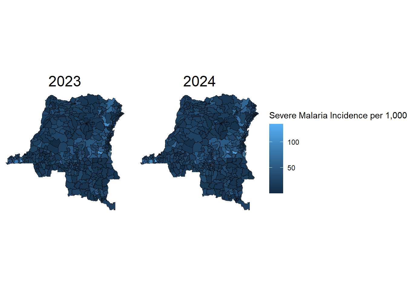
If we just plot our data with the severe_per_thousand variable, it will be read as a continuous variable, and the
summary(geo_dat$severe_per_thousand) Min. 1st Qu. Median Mean 3rd Qu. Max.
0.80 13.37 20.71 24.73 31.25 135.08 geo_dat %>%
ggplot() +
geom_sf(aes(fill =severe_per_thousand_cut, geometry = geometry)) +
scale_fill_viridis_d(option = "plasma") +
facet_wrap(vars(year)) +
theme_void() +
theme(strip.text = element_text(size = 18)) +
labs(fill = "Severe Malaria Incidence per 1,000")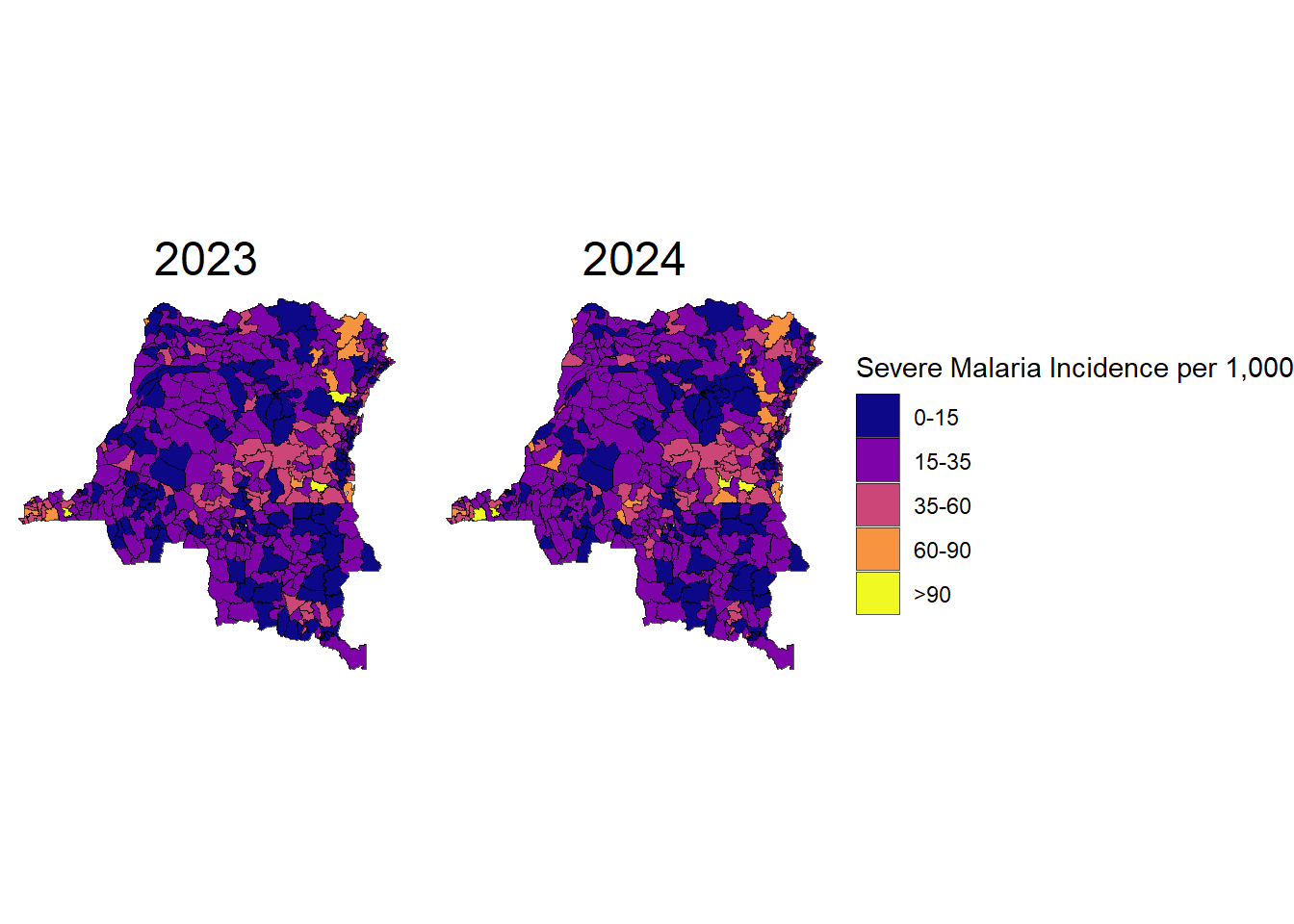
Play around with different buckets for the color of the map cells, themes, etc. What do you think is the best way to make this chart look interesting and informative?
Step 12 - Think carefully about how you might share this script with others are your code steps commented? are your steps reproducible? are outputs saved to a shared project folder?