library(tidyverse)
library(janitor)
library(lubridate)
library(readr)

mal_dat <- read_csv("data/hf_malaria_data_anonymised.csv")12 Visualisations to Explore and Summarise Data Completeness
12.1 Working with routine data
When we’re working with any data set we should first explore the data elements in close detail. This includes assessing completeness and identifying any anomalies.
With routine surveillance data, we should always look at the data starting from it’s lowest level: the HF-month-indicator level.
12.1.0.1 Read in the data set and required libraries
12.1.0.2 Explore the data
Have a quick look at the data elements
head(mal_dat)# A tibble: 6 × 8
new_adm1 new_adm2 new_hf year month period total_confirmed_cases
<chr> <chr> <chr> <dbl> <dbl> <date> <dbl>
1 province_A district_1 HF_1 2017 1 2017-01-01 0
2 province_A district_1 HF_1 2017 2 2017-02-01 0
3 province_A district_1 HF_1 2017 3 2017-03-01 0
4 province_A district_1 HF_1 2017 4 2017-04-01 0
5 province_A district_1 HF_1 2017 5 2017-05-01 0
6 province_A district_1 HF_1 2017 6 2017-06-01 0
# ℹ 1 more variable: total_tested <dbl>n_distinct(mal_dat$new_adm1)[1] 7n_distinct(mal_dat$new_adm2)[1] 41n_distinct(mal_dat$new_hf)[1] 20612.1.0.3 Plot the completeness
A really nice way to look at the completeness in data is to use geom_tile in tidyverse to make a grid where each row is a health facility, each column in a month, and the color of each square is the value of some variable.
As we have 206 HFs in our dataset, we’ll limit the plot to just look at a single province, and we’ll explore malaria case data
mal_dat %>% filter(new_adm1 == "province_A") %>%
  ggplot() +
  geom_tile(aes(x = period, y = new_hf, fill = total_confirmed_cases),
            color = "white") +
  ggtitle("Province A")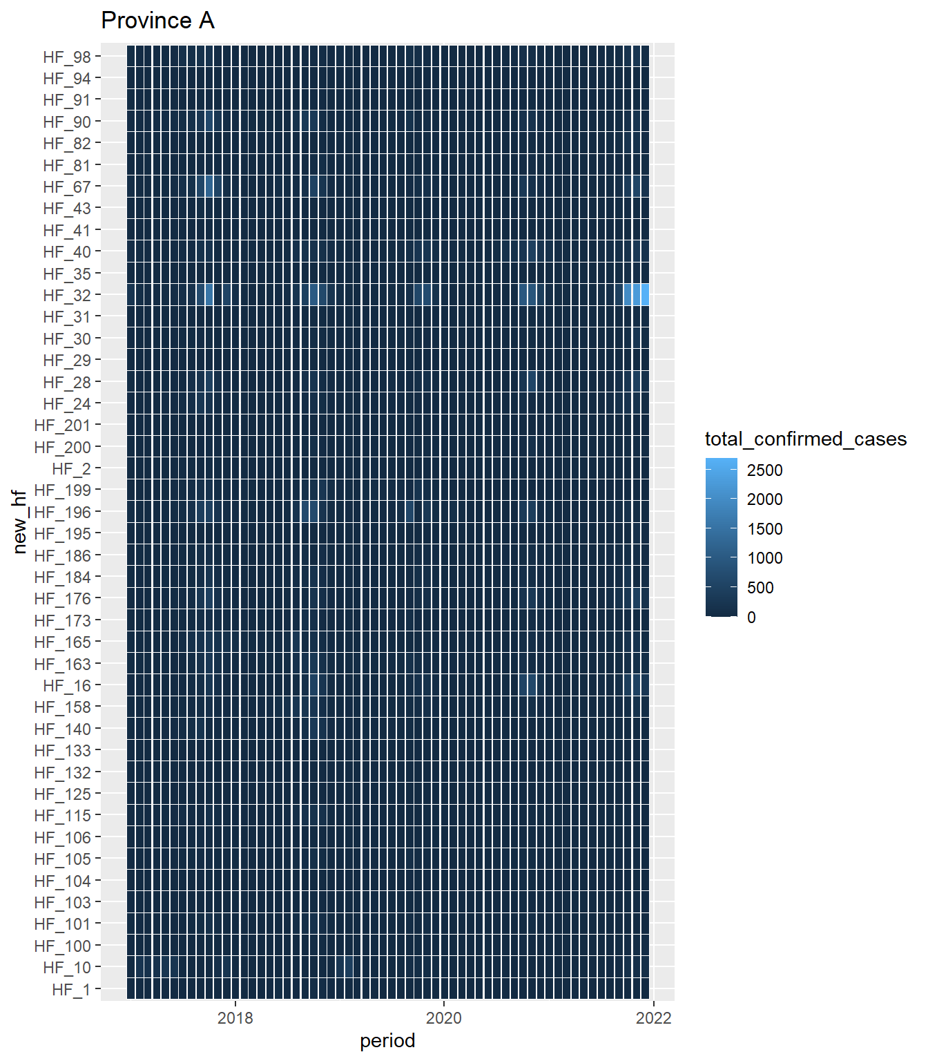
Our first attempt isn’t very informative! This is because most the values are very low, and due to the linear color scale, we can’t differentiate between low colors
Let’s look at the distribution of the data and pick some more useful color breaks and a non-linear color scale
quantile(mal_dat$total_confirmed_cases, seq(0,1, by = 0.1)) 0% 10% 20% 30% 40% 50% 60% 70% 80% 90% 100%
0 0 0 0 0 0 2 6 17 56 2693 mal_dat %>% filter(new_adm1 == "province_A") %>%
ggplot() +
geom_tile(aes(x = period, y = new_hf, fill = total_confirmed_cases),
color = "white") +
ggtitle("Province A") +
scale_fill_viridis_c("Confirmed cases", na.value = "grey90", direction = -1,
breaks = c(1, 10, 25, 100, 500, 2500),
trans = scales::transform_log(), option = "magma") +
theme_bw()Warning in scale_fill_viridis_c("Confirmed cases", na.value = "grey90", :
log-2.718282 transformation introduced infinite values.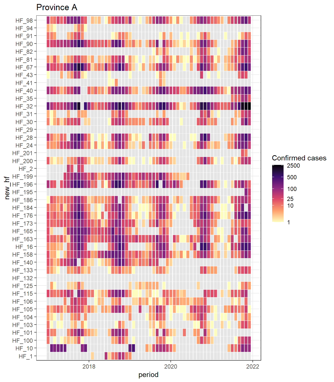
We have a lot of zeros in our data, and we’ve used a log10 transform, so a lot of our values become NA.
To avoid this we can apply a simple trick of setting all 0 values to some small number, here we choose 0.1. We then use the labels argument in scale_fill_viridis_c to show that we mean this value to be 0.
mal_dat %>% filter(new_adm1 == "province_A") %>%
  mutate(total_confirmed_cases = ifelse(total_confirmed_cases == 0, 0.1, total_confirmed_cases)) %>%
  ggplot() +
  geom_tile(aes(x = period, y = new_hf, fill = total_confirmed_cases),
            color = "white") +
  ggtitle("Province A") +
  scale_fill_viridis_c("Confirmed cases", na.value = "grey90", direction = -1,
                       breaks = c(0.1, 2, 10, 25, 100, 500, 2500),
                       labels = c(0, 2, 10, 25, 100, 500, 2500),
                       trans = scales::transform_log(), option = "magma") +
  theme_bw()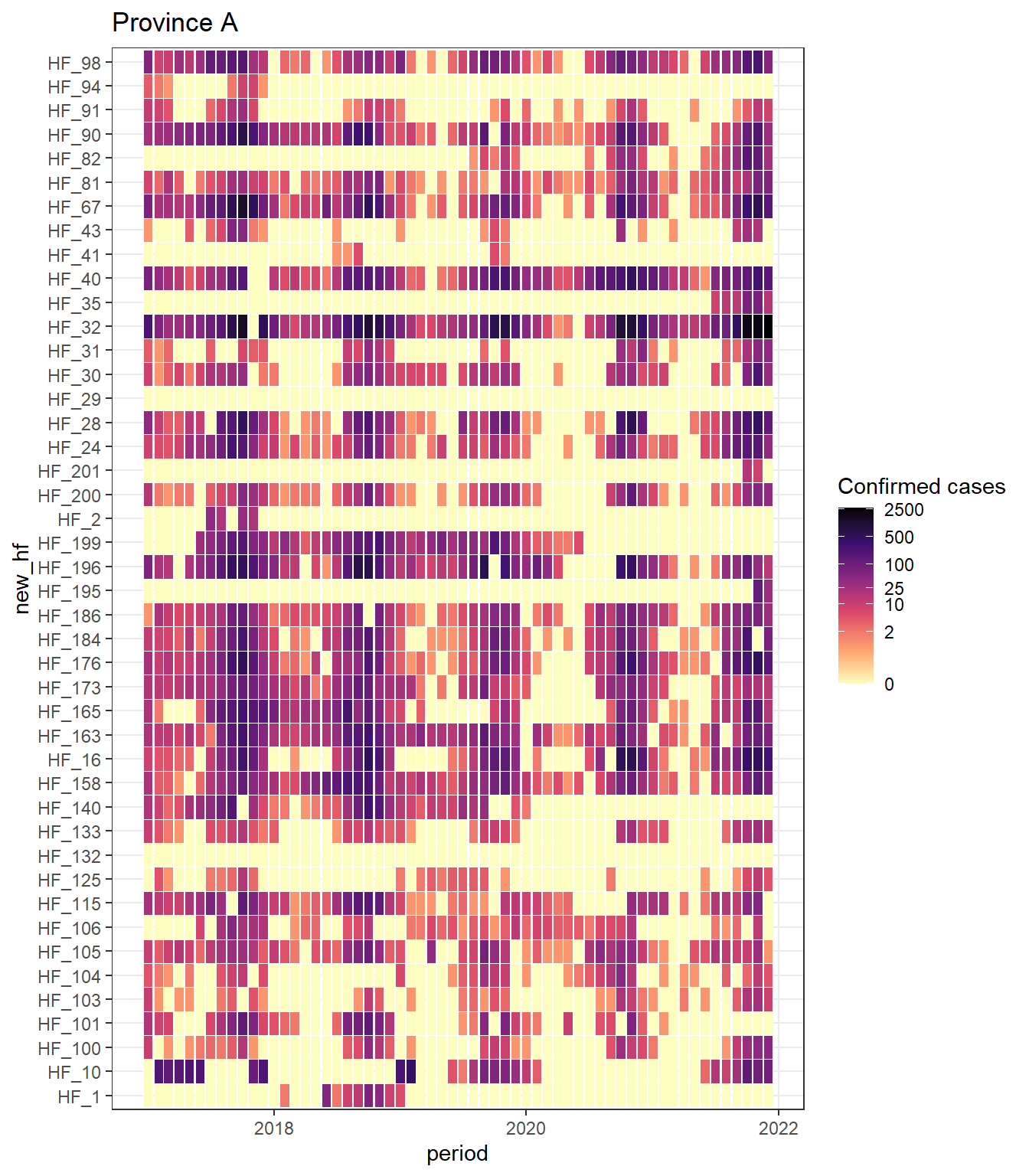
These plots are a really useful way to better understand your data - this raises a range of concerns to me that I’d want to investigate
- There is no distinction between 0 and NA
- There are some facilities that seemingly never report malaria data (always 0) - do these facilities actually treat malaria cases? Should they be excluded from the analysis?
- Some facilities are high performers, only missing a few months over 2 years
- Some facilities look like they may have opened or started reporting data midway through the period - if there a HF georegistry we can use to confirm this? Should we exclude 0 values before the opening date in reporting rate calculations?
I would now make one of these for each of the provinces to identify more data issues
If I were conducting this analysis for a NMP, I’d want to think of some summary plots that gives a province level summary
mal_dat_prov_summary <- mal_dat %>%
  group_by(new_adm1, year) %>%
  summarise(n_pos_reports = length(which(total_confirmed_cases == 0)),
            n_expected_reports = n()) %>%
  ungroup() %>%
  mutate(prop_pos_reports = n_pos_reports/n_expected_reports)
`summarise()` has grouped output by 'new_adm1'. You can override using the
`.groups` argument.ggplot(mal_dat_prov_summary) +
geom_col(aes(x = as.factor(year), y = prop_pos_reports)) +
facet_wrap(~new_adm1)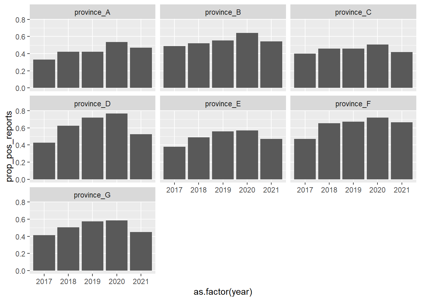
This might bias for higher values in areas with more malaria transmission, which isn’t the message we’re trying to portray
Try a creating a new variable that shows whether either cases or tests was reported in a given month
mal_dat_prov_summary_v2 <- mal_dat %>%
  mutate(any_data_rep = ifelse(total_confirmed_cases == 0 | total_tested == 0, 1, 0)) %>%
  group_by(new_adm1, year) %>%
  summarise(n_reports = sum(any_data_rep),
            n_expected_reports = n()) %>%
  ungroup() %>%
  mutate(prop_reports = n_reports/n_expected_reports)
`summarise()` has grouped output by 'new_adm1'. You can override using the
`.groups` argument.ggplot(mal_dat_prov_summary_v2) +
geom_col(aes(x = as.factor(year), y = prop_reports)) +
facet_wrap(~new_adm1)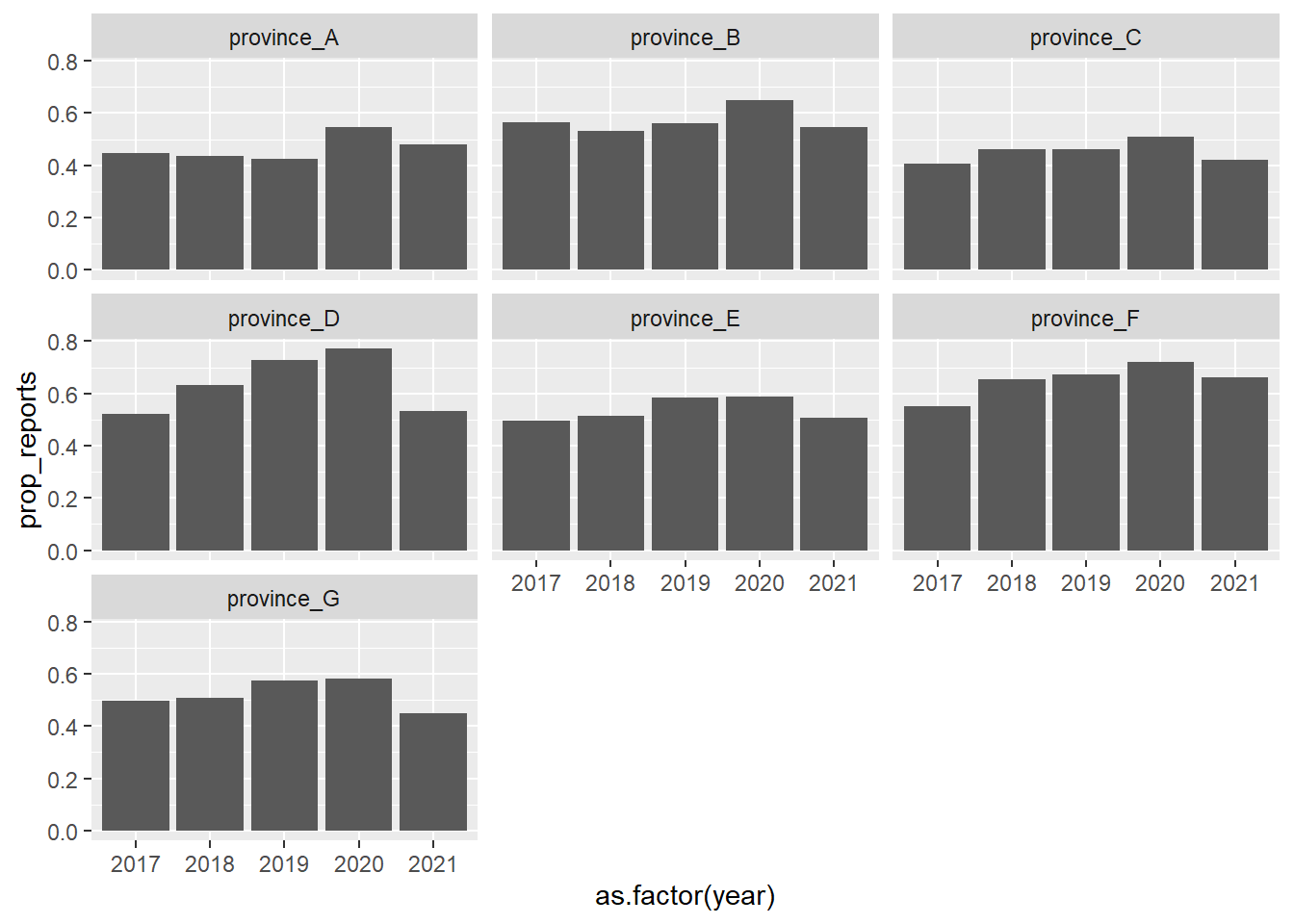
Now lets make this plot look nicer
ggplot(mal_dat_prov_summary_v2) +
  geom_col(aes(x = as.factor(year), y = prop_reports, fill = prop_reports)) +
  labs(x = "year", y = "Proportion of facility-months where either\nmalaria cases or tested reported") +
  geom_text(aes(x = as.factor(year), y = prop_reports + 0.08,
                label = (paste0(round(prop_reports*100, 0), "%")))) +
  ylim(c(0,1))+
  ggtitle("Summary of reporting rates by Province") +
  viridis::scale_fill_viridis("Proportion of\nexpected reports", option = "mako", begin = 0.3, end = 0.8) +
  facet_wrap(~new_adm1) +
  theme_bw()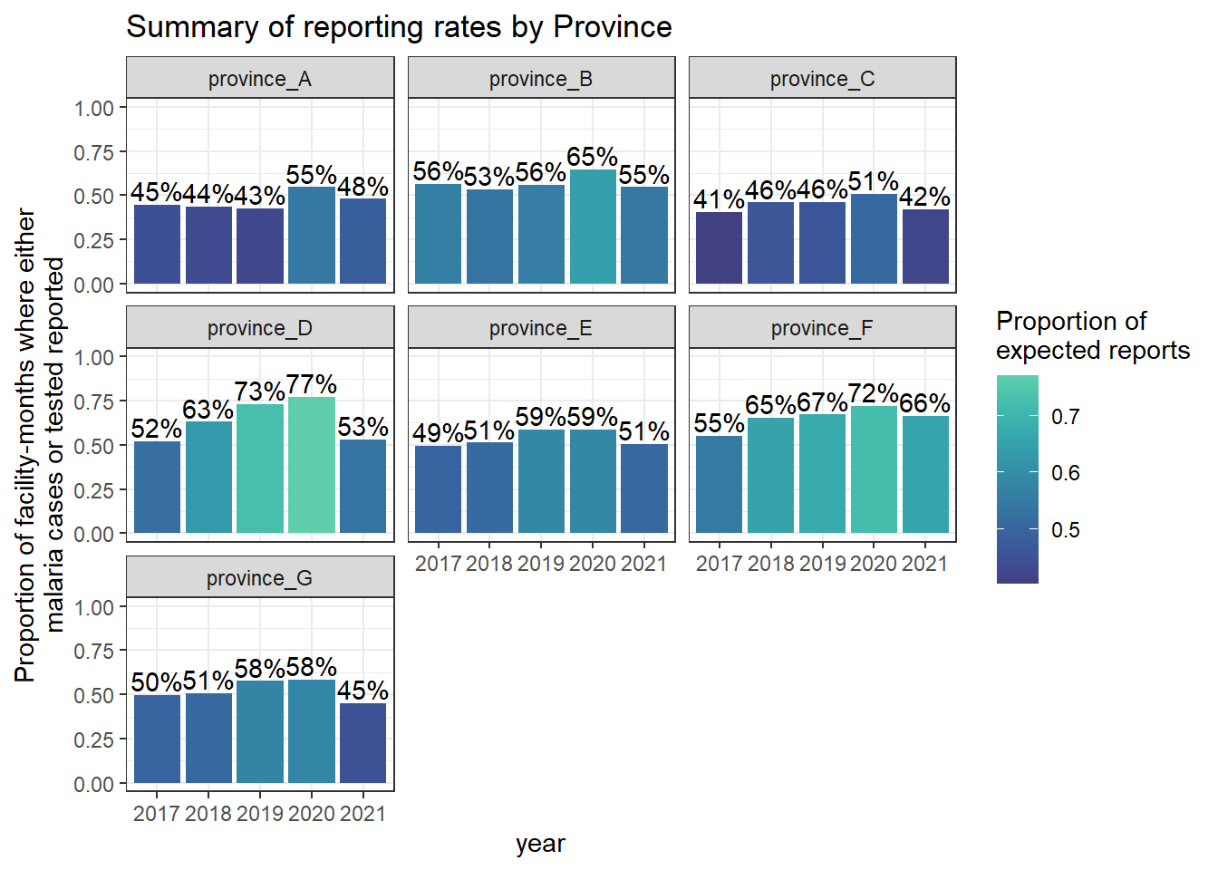
12.1.0.4 Final thoughts
geom_tileplots are a great was to visualise and better understand large amounts of monthly-level health facility data. Once we have a grasp on these issues, we can summarise the data to best inform NMP teams.
We should always think really carefully about the missingness in our data and how to handle it.
NEVER aggregate data without understanding issues at the lowest level. Aggregation can mask these issues.