Missing data can mislead readers if not clearly indicated. Rather than disappearing from view or defaulting to zero, missing values can be shown visually using shaded areas or markers. This helps distinguish reporting gaps from true reductions and improves the transparency of your visualizations.
11.2 Load the Data
We’ll be working with malaria case data that includes presumed and confirmed cases by month, location of the file:
Box > Data fellowship common folder > secondary-r-skills > data-viz > data > plotluck-data-missing.rds
library(dplyr)
Attaching package: 'dplyr'
The following objects are masked from 'package:stats':

    filter, lag
The following objects are masked from 'package:base':

    intersect, setdiff, setequal, union
library(ggplot2)library(lubridate)
Attaching package: 'lubridate'
The following objects are masked from 'package:base':

    date, intersect, setdiff, union
library(scales)# Load the datasetdf_conf_pred <-readRDS("./data/plotluck-data-missing-anonymised.rds")
11.3 Understand the Structure
Let’s inspect the structure of the dataset:
head(df_conf_pred)
# A tibble: 6 × 7
  state lga       lga_id       year period     data_type count
  <chr> <chr>     <chr>       <dbl> <date>     <chr>     <dbl>
1 Abia  Aba North NmLIx68MjRi  2020 2020-01-01 confirmed   232
2 Abia  Aba North NmLIx68MjRi  2020 2020-01-01 presumed    202
3 Abia  Aba North NmLIx68MjRi  2020 2020-02-01 confirmed   168
4 Abia  Aba North NmLIx68MjRi  2020 2020-02-01 presumed    212
5 Abia  Aba North NmLIx68MjRi  2020 2020-03-01 confirmed   138
6 Abia  Aba North NmLIx68MjRi  2020 2020-03-01 presumed    199
You’ll see five key columns:
state and lga names
period: the month of reporting
count: number of malaria cases reported
data_type: whether it’s a confirmed or presumed case
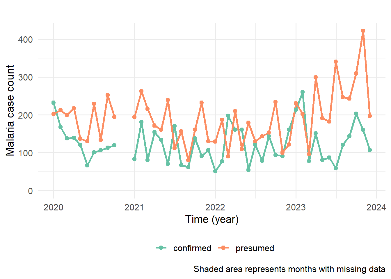
If we just decide to plot the time series of the counts for our different data_types for this single LGA we would get a plot like that below:
ggplot(data = df_conf_pred,mapping =aes(x = period, y = count)) +geom_line(aes(color = data_type), linewidth =1.2) +geom_point(aes(color = data_type), size=2) +scale_color_brewer(palette ="Set2") +labs(x ="Time (year)", y ="Malaria case count",title =" ",col ="", fill="", caption="Shaded area represents months with missing data") +aes(ymin=0) +theme_minimal(14) +theme(legend.position ="bottom") +scale_y_continuous(labels = scales::comma)
Ignoring unknown labels:
• fill : ""
Warning: Removed 4 rows containing missing values or values outside the scale range
(`geom_point()`).
And we can see a warning that is telling us that 6 rows have been removed from the dataset due to missing data.
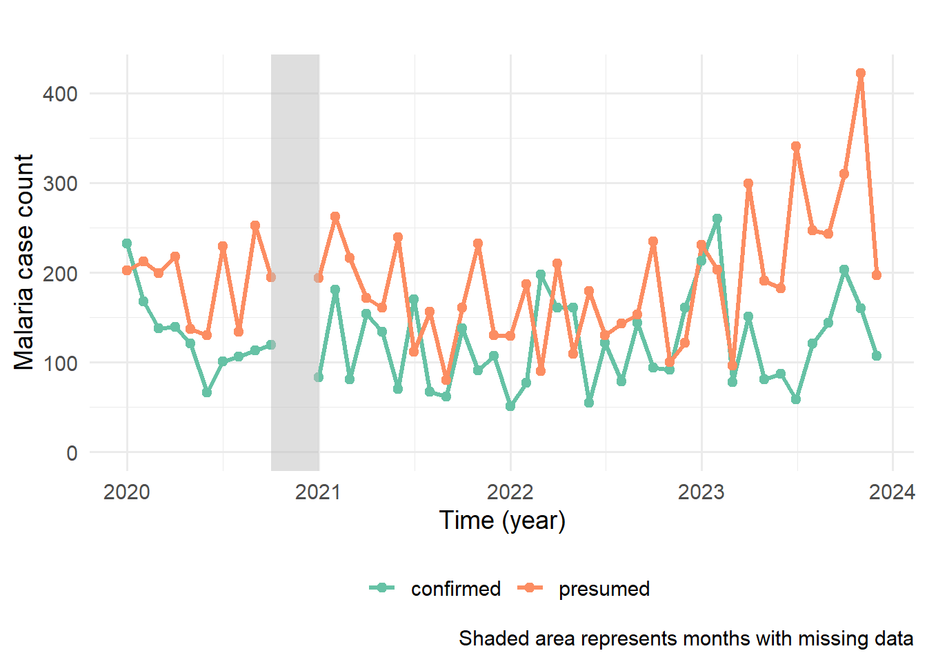
11.4 Add Visual Cues for Missing Data
First lets use the following code to identify periods of missing data:
# Identify the ranges of missing datamissing_ranges <- df_conf_pred %>%# Start with the main datasetgroup_by(data_type) |># Group by data type (e.g., presumed or confirmed)mutate(missing =is.na(count)) %>%# Create a logical variable marking where count is NA (i.e., missing)mutate(group =cumsum(!missing)) %>%# Assign a unique group ID that increments when data is not missinggroup_by(group, data_type) %>%# Group by both run-length group and data typesummarize(start =min(period), end =max(period)) %>%# For each group, find the start and end of the periodfilter(start != end) # Filter out same start and end months
`summarise()` has grouped output by 'group'. You can override using the
`.groups` argument.
missing_ranges
# A tibble: 2 × 4
# Groups:   group [1]
  group data_type start      end
  <int> <chr>     <date>     <date>
1    10 confirmed 2020-10-01 2020-12-01
2    10 presumed  2020-10-01 2020-12-01
Now lets highlight the range specifically on the plot:
ggplot(data = df_conf_pred, # Set up base ggplot object using the datasetmapping =aes(x = period, y = count)) +# Set aesthetics: time on x-axis, count on y-axisgeom_line(aes(color = data_type), linewidth =1.2) +# Draw line plot of case counts, colored by data typegeom_point(aes(color = data_type), size=2) +# Add points to show individual valuesscale_color_brewer(palette ="Set2") +# Use color palette from ColorBrewerlabs(x ="Time (year)", y ="Malaria case count", # Add axis labels, remove legends, add captiontitle =" ", col ="", fill="", caption="Shaded area represents months with missing data") +aes(ymin=0) +# Make sure ymin is always zero for correct shadingtheme_minimal(14) +# Use minimal theme with larger base font sizetheme(legend.position ="bottom") +# Move legend to bottom of the plotscale_y_continuous(labels = scales::comma) +# Format y-axis values with commas (e.g., 10,000)# Add shaded rectangles for missing periodsgeom_rect(data = missing_ranges, # Use the data with start and end of missing rangesaes(xmin = start, # Start of the missing period on the x-axisxmax = end %m+%months(1), # End of the missing period + 1 month (so the last month is fully shaded) - %m+% is lubridate plus operatorymin =-Inf, # Start shading from the bottom of the plotymax =Inf), # End shading at the top of the plotfill ="gray", # Fill the shaded area with light grayalpha =0.3, # Set transparency to make plot readable through the shaded regioninherit.aes =FALSE) # Do not inherit global ggplot aesthetics for this layer
Ignoring unknown labels:
• fill : ""
Warning: Removed 4 rows containing missing values or values outside the scale range
(`geom_point()`).
Now, the missing periods are visibly shaded, drawing attention to gaps in the time series.