# Load package libraries
library(tidyverse)
library(lubridate)
library(data.table)13 Time Series Plotting
14 Time Series Plotting
14.1 Why you would want to plot time series data
This is something we often want to do with monthly case or environmental data to track trends over the course of a malaria season which does not always correspond to a calendar year.
Plotting as a time series allows you to compare the same months over the course of several years, making it easier to spot annual trends that could be related to changes in the environment or vector control distributions.
14.2 How to reshape your time series data
There are two main steps to doing this with monthly data. The first is to reshape the data to the “transmission year” for malaria data. This will vary from country-to-country.
Now, we will demonstrate how to reshape your data.
# Make sure you are using the R project for data-viz within the data fellowship common folder

# read-in data
monthly_env_data <-readRDS("data/time-series-data-anonymised.rds")

# Using the data table package can make this step much faster than a standard mutate for big datasets
# We set the transmission year based on the country's malaria seasonality patterns
time_series <- data.table::as.data.table(monthly_env_data)
time_series <- time_series[, trans_year := fcase(
  period >= "2020-09-01" & period <= "2021-08-01", 2020,
  period >= "2021-09-01" & period <= "2022-08-01", 2021,
  period >= "2022-09-01" & period <= "2023-08-01", 2022,
  period >= "2023-09-01" & period <= "2024-08-01", 2023,
  period >= "2024-09-01" & period <= "2025-08-01", 2024,
  default = NaN)] %>%
  filter(!is.na(trans_year))

# In order to properly order the graph, we make a transmission month variable and regroup the data
time_series_prov <- time_series %>%
  mutate(trans_month = case_when(month == 9 ~ 1,
                                 month == 10 ~ 2,
                                 month == 11 ~ 3,
                                 month == 12 ~ 4,
                                 month == 1 ~ 5,
                                 month == 2 ~ 6,
                                 month == 3 ~ 7,
                                 month == 4 ~ 8,
                                 month == 5 ~ 9,
                                 month == 6 ~ 10,
                                 month == 7 ~ 11,
                                 month == 8 ~ 12)) %>%
  # This month.abb[] command allows us to use the three-letter month abbreviation on our plot, i.e. April become APR
  mutate(month = month.abb[month]) %>%
  group_by(trans_year, trans_month, month,
           reported_province) %>%
  summarise(total_rainfall = sum(total_rainfall, na.rm = TRUE),
            avg_temp = mean(mean_temp),
            avg_night_temp = mean(mean_night_temp),
            avg_diurnal = mean(diurnal_temp_diff)) %>%
  ungroup()
`summarise()` has grouped output by 'trans_year', 'trans_month', 'month'. You
can override using the `.groups` argument.14.3 How to plot timeseries data using ggplot()
The second step is to use the “reorder” command either before or during your ggplot call to properly order the lines colored and grouped by transmission year. Note that if you do not make the grouping/reordering call, your data will appear out of order, see below for examples with vs without the reordering.
night_temp_ts_plot <- time_series_prov %>%
  # for this plot we change the transmission year labels to make them clearer for the reader
  mutate(trans_year = case_when(trans_year == 2020 ~ "2020-2021",
                                trans_year == 2021 ~ "2021-2022",
                                trans_year == 2022 ~ "2022-2023",
                                trans_year == 2023 ~ "2023-2024",
                                trans_year == 2024 ~ "2024-2025")) %>%
  ggplot() +
  # the reorder command here reorders the month by the transmission month defined above to keep it in the proper order
  geom_line(aes(x = reorder(month, trans_month), y = avg_night_temp,
                color = as.factor(trans_year),
                group = trans_year), lwd = 1) +
  labs(x = "Month", y = "Average Night Temperature (Celsius)",
       color = "Transmission Year \n(Sept-Aug)") +
  # we set a manual color scale using our defined trans year labels
  scale_color_manual(breaks = c("2020-2021","2021-2022", "2022-2023", "2023-2024", "2024-2025"),
                     values = c("lightsteelblue2", "lightcyan3", "azure3",  "#FF3333", "#FF8000")) +
  theme_bw() +
  facet_wrap(. ~ reported_province) +
  theme(axis.text.y = element_text(size = 14),
        legend.text = element_text(size = 14),
        legend.title = element_text(size = 16),
        axis.title = element_text(size = 16),
        axis.text.x = element_text(size = 12, angle = 90),
        strip.text = element_text(size = 16),
        strip.background = element_rect(fill = "white"))

night_temp_ts_plot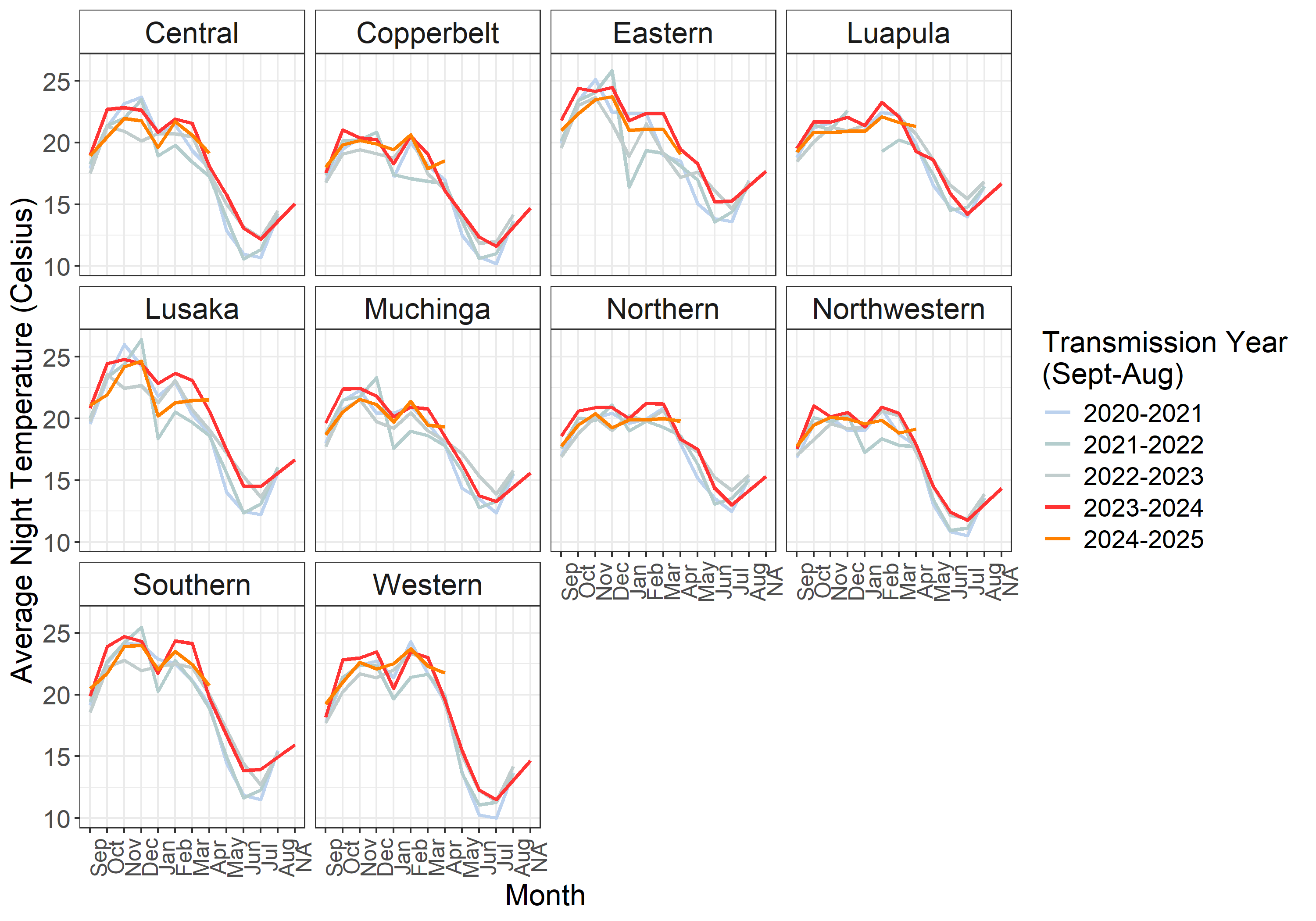
time_series_prov %>%
  mutate(trans_year = case_when(trans_year == 2020 ~ "2020-2021",
                                trans_year == 2021 ~ "2021-2022",
                                trans_year == 2022 ~ "2022-2023",
                                trans_year == 2023 ~ "2023-2024",
                                trans_year == 2024 ~ "2024-2025")) %>%
  ggplot() +
  # without the reorder command, the data are displayed incorrectly
  geom_line(aes(x = month, y = avg_night_temp,
                color = as.factor(trans_year),
                group = trans_year), lwd = 1) +
  labs(x = "Month", y = "Average Night Temperature (Celsius)",
       color = "Transmission Year \n(Sept-Aug)") +
  scale_color_manual(breaks = c("2020-2021","2021-2022", "2022-2023", "2023-2024", "2024-2025"),
                     values = c("lightsteelblue2", "lightcyan3", "azure3",  "#FF3333", "#FF8000")) +
  theme_bw() +
  facet_wrap(. ~ reported_province) +
  theme(axis.text.y = element_text(size = 14),
        legend.text = element_text(size = 14),
        legend.title = element_text(size = 16),
        axis.title = element_text(size = 16),
        axis.text.x = element_text(size = 12, angle = 90),
        strip.text = element_text(size = 16),
        strip.background = element_rect(fill = "white"))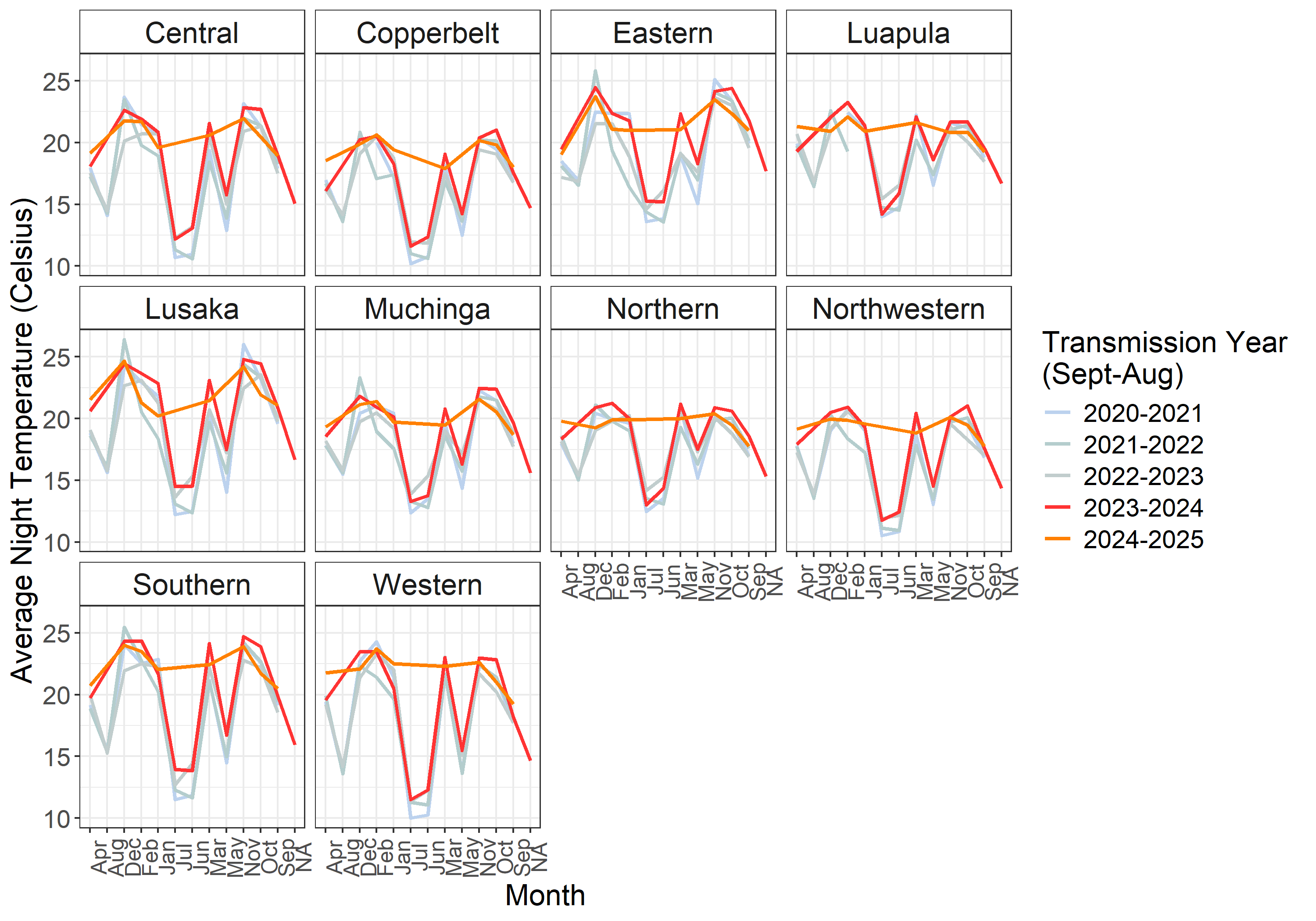
14.4 Practical Tips for Visualizing Time Series Data
- Double check your dates: Make sure you are using the proper definitions of the transmission season in your country of interest.
- Use clear labels:
2020-2021will make more sense thanThe 2020 transmission yearto most audiences - Use clear colors: Highlight the most recent or most interesting years visually against older or less relevant data.
- Remember to reorder your data: If you don’t use the reordered
transmission monthand you group by transmission year alone, your data won’t make sense visually.