This tutorial walks through visualising data using ggplot2 faceting and the geofacet package for improved spatial faceting.
14.1 What is 📦geofacet?
The geofacet package is an extension to ggplot2 that allows you to facet plots geographically, rather than alphabetically or by some pre-determined factor organisation. This means that subplots can be arranged in a layout that reflects their relative locations in a country or region—improving interpretability when exploring spatial patterns.
Important
Geofaceting arranges a sequence of plots of data for different geographical entities into a grid that strives to preserve some of the original geographical orientation of the entities.
Incidence per 1,000 population (confirmed_inc_per_1000)
Let’s determine the time span covered:
min(case_data$year)
[1] 2020
max(case_data$year)
[1] 2023
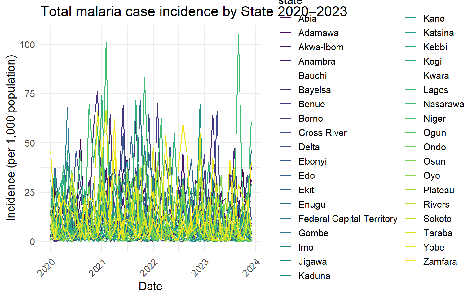
Now lets plot these total case counts in a time series plotting all of our States in a single plot.
ggplot(case_data, aes(x = period, y = confirmed_inc_per_1000, color = state)) +# define plotting values from the datageom_line() +# make a line chartlabs(y ="Incidence (per 1,000 population)", x ="Date",title ="Total malaria case incidence by State 2020–2023") +# update the text labelsscale_color_viridis_d("state") +# use viridis colour palette theme_minimal(base_size =14) +# set theming scale_y_continuous(labels = comma) +# use clean yaxis numeric labelstheme(axis.text.x =element_text(angle =45, hjust =1)) # rotate x axis for clarity
What you will see here is that there is alot of information contained in this plot and it’s hard for us to distinguish within and between the different states. In addition the colour legend takes up a large proportion of the plot space making it harder to read.
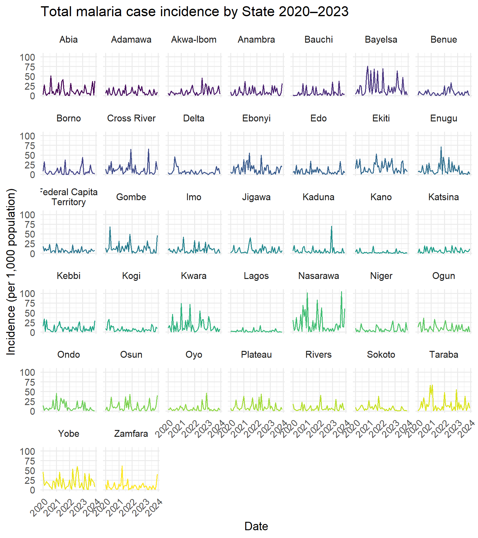
14.4 Facet Plot Using Alphabetical Layout
Faceting allows us to break out this large plot into individual sub plots for each State with a single line of code facet_wrap(~ state, labeller = label_wrap_gen(width = 20, multi_line = TRUE)) and the can turn the legend off as each plot has its own State title.
ggplot(case_data, aes(x = period, y = confirmed_inc_per_1000, color = state)) +geom_line(show.legend =FALSE) +# hide legendfacet_wrap(~ state, labeller =label_wrap_gen(width =20, multi_line =TRUE)) +# facet individual plotslabs(y ="Incidence (per 1,000 population)", x ="Date",title ="Total malaria case incidence by State 2020–2023") +scale_color_viridis_d("state") +theme_minimal(base_size =14) +scale_y_continuous(labels = comma) +theme(axis.text.x =element_text(angle =45, hjust =1))
Now each state has its own subplot, which is easier to interpret. However, notice that these subplots are still ordered alphabetically and don’t reflect the geographic arrangement of states in Nigeria. We could plot a series of maps that contain this information to assess spatial trends but this would result in over 12 months * 4 years = 48 maps which is alot.
Instead we can use geofacet to arrange facets in a grid that mirrors their geographic location.This helps highlight spatio/temporal trends.
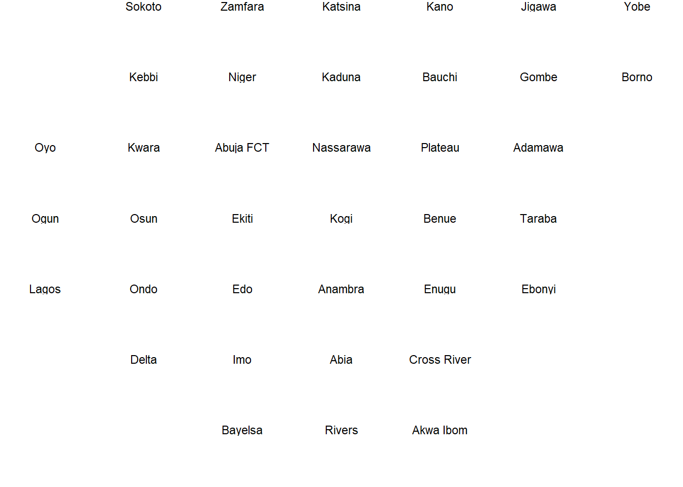
14.5 Use a Prebuilt Geographical Grid
geofacet includes a built-in Nigerian state grid (ng_state_grid1). This arranges states in a rough geographic layout.
# Preview the Nigerian state grid layoutgeofacet::ng_state_grid1 |>ggplot() +theme_void() +facet_geo(~ name, grid ="ng_state_grid1")
This plot confirms the grid structure before using it in our malaria plot.
14.6 Tidy Grid Naming to Match Your Data
Sometimes, the naming conventions in the geofacet grid don’t match your dataset exactly. You’ll need to harmonize these.
#save grid to objectng_state_grid <- geofacet::ng_state_grid1 # check for discordant names anti_join(tibble::as_tibble(ng_state_grid), case_data, by=c("name"="state"))
# adjust those discordant names to match case_data ng_state_grid$name[ng_state_grid$name =="Akwa Ibom"] <-"Akwa-Ibom"ng_state_grid$name[ng_state_grid$name =="Abuja FCT"] <-"Federal Capital Territory"ng_state_grid$name[ng_state_grid$name =="Nassarawa"] <-"Nasarawa"
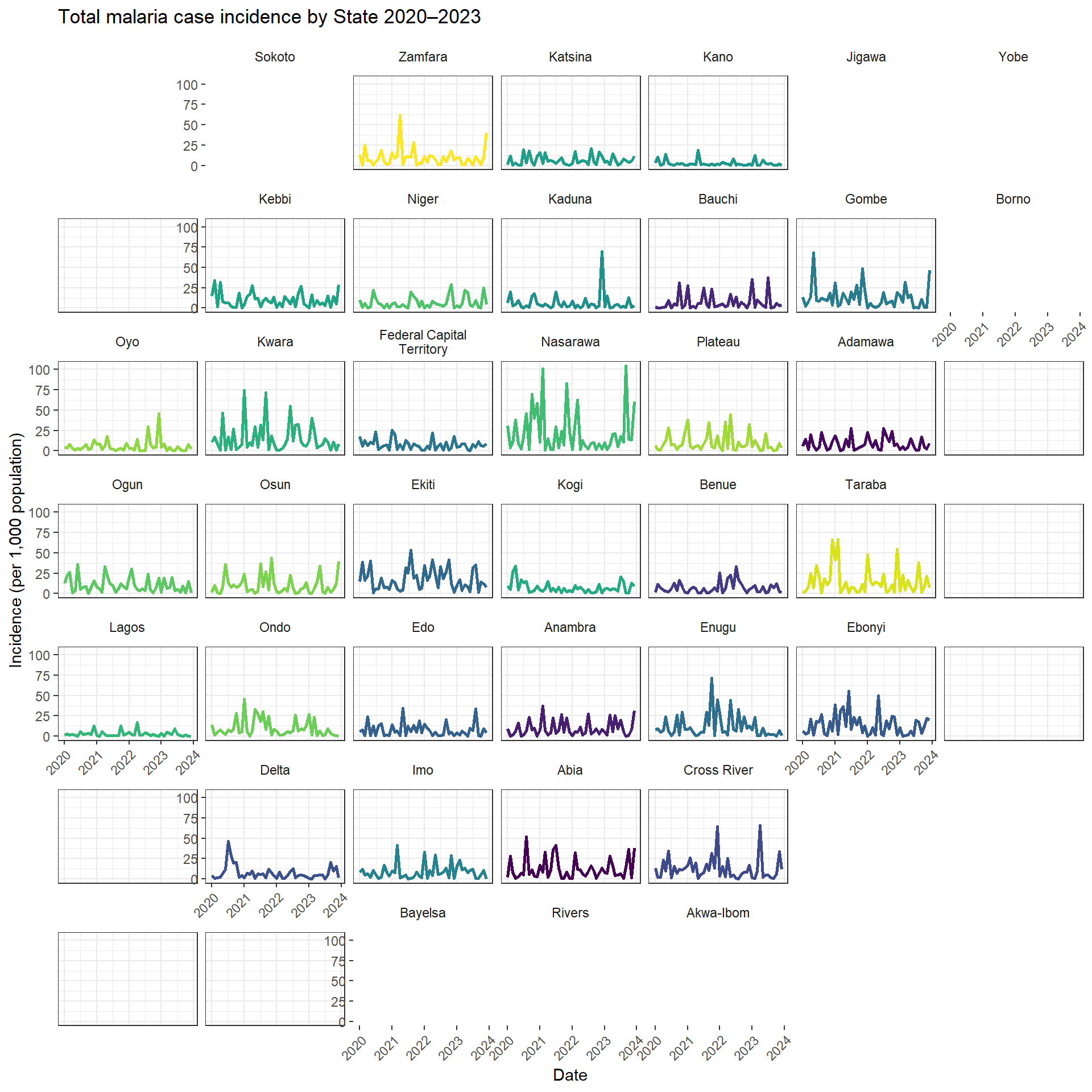
14.7 Create the Geofaceted Plot
Let’s use facet_geo() to visualize state-level malaria data with Nigeria’s spatial layout.
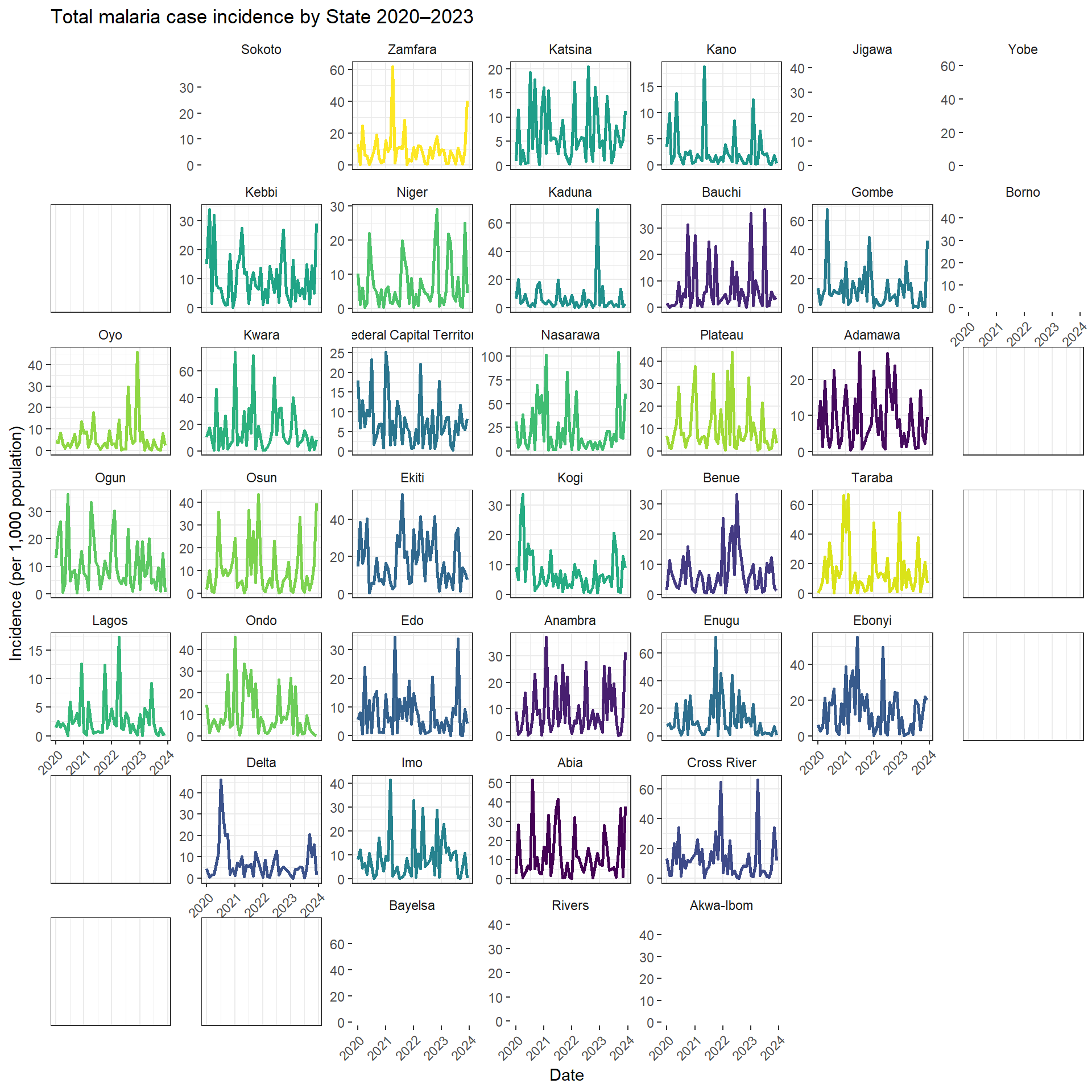
ggplot(case_data, aes(x = period, y = confirmed_inc_per_1000, color = state)) +facet_geo(~ state, grid = ng_state_grid, label ="name",labeller =label_wrap_gen(width =20, multi_line =TRUE)) +geom_line(show.legend =FALSE, linewidth =1) +labs(y ="Incidence (per 1,000 population)", x ="Date",title ="Total malaria case incidence by State 2020–2023") +scale_color_viridis_d("state") +theme_bw() +scale_y_continuous(labels = comma, limits =c(0, NA)) +theme(axis.text.x =element_text(angle =45, hjust =1),strip.background =element_blank())
Each state’s line plot is now displayed in a layout that approximates Nigeria’s geography. This makes it easier to explore spatial trends—e.g., higher incidence in the north.
14.8 Optional — Use Free Scales to Zoom Per State
To better explore local trends, enable independent y-axis scales:
ggplot(case_data, aes(x = period, y = confirmed_inc_per_1000, color = state)) +facet_geo(~ state, grid = ng_state_grid, label ="name",scales ="free_y") +# free the y-axis scalegeom_line(show.legend =FALSE, linewidth =1) +labs(y ="Incidence (per 1,000 population)", x ="Date",title ="Total malaria case incidence by State 2020–2023") +scale_color_viridis_d("state") +theme_bw() +scale_y_continuous(labels = comma) +theme(axis.text.x =element_text(angle =45, hjust =1),strip.background =element_blank())
This way we can also determin certain patterns in the data - for example malaria transmission is more highly seasonal in the North East of the country, we can also see that for certain states incidence rates drop to 0 unexpectedly which highlights some potential data quality issues that aren’t spatially correlated to explore.
14.9 🧩 Bonus: Build a Custom Grid from Scratch
If your country or subnational boundaries aren’t supported, you can create a custom grid through the package.
Creating your own grid is as easy as specifying a data frame with columns row and col containing unique pairs of positive integers indicating grid locations and columns beginning with name and code.
To design a grid you can launch this helpful application starting by visiting this link or from R by calling:
grid_design()
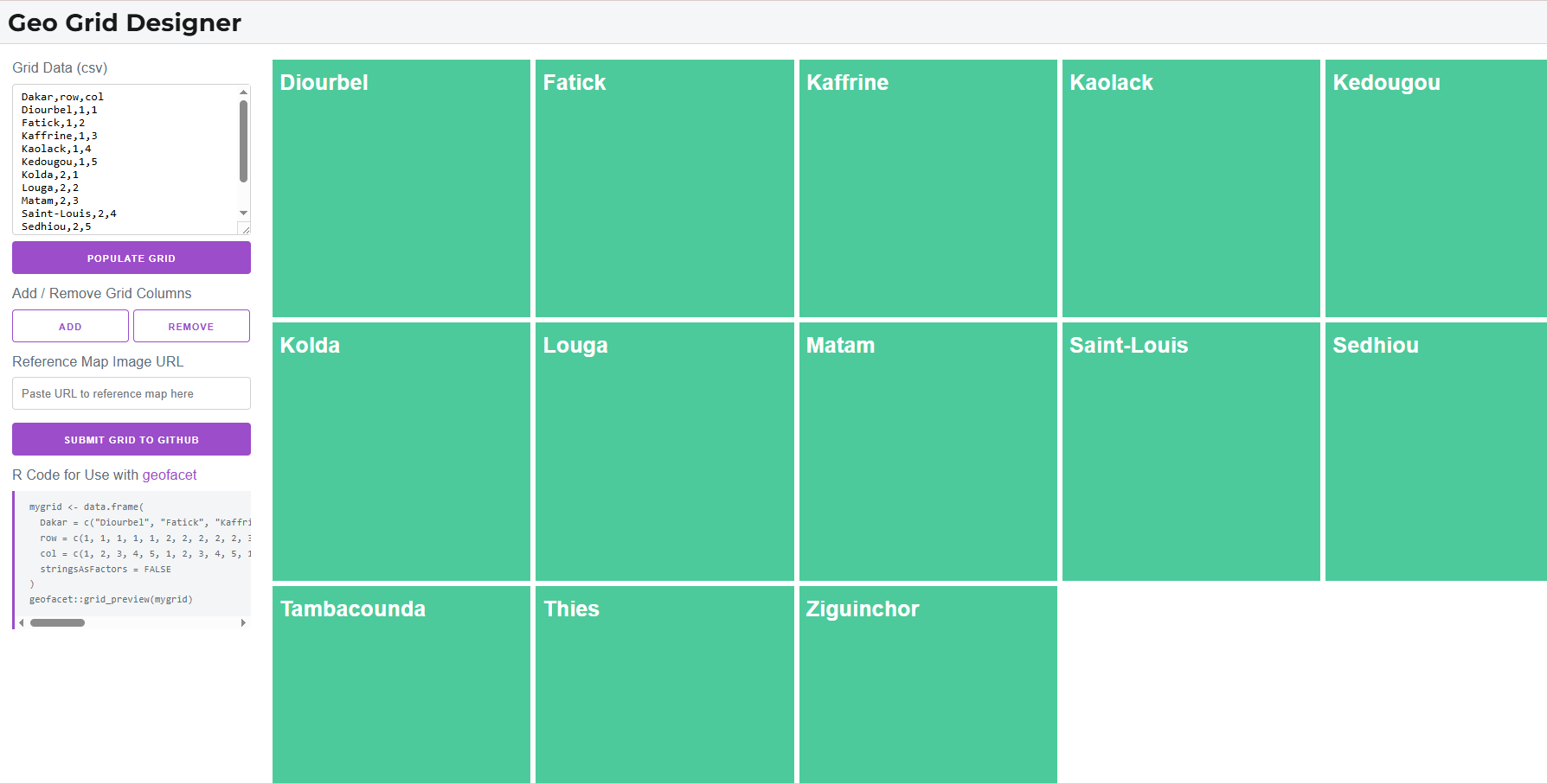
This will open up a web application with an empty grid and instructions on how to fill it out. Basically you just need to paste in csv content about the geographic entities (the row and col columns are not required at this point).
For example if I wanted to recreate a grid of the regions of Senegal I would take the following steps:
Copy region names from a .csv file into the text box
Then a grid of squares with these column attributes will be populated and you can interactively drag the squares around to get the grid you want. You can also add a link to a reference map to help you as you arrange the tiles.
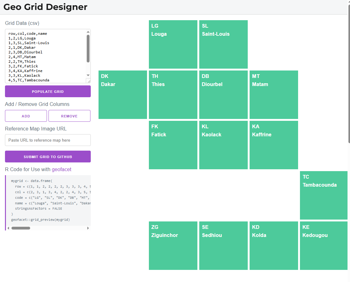
Once you are happy you will have something like the image below - and the R Code from the tool can be copied and stored as your grid object to use with facet_geo()