library(tidyverse)
library(lubridate)
10 Exploratory data analysis
10.1 The rationale for exploring your data
Exploratory data analysis is a critical first step in working with routine malaria surveillance data. It allows us to understand what we are actually working with before drawing conclusions or building analyses, and helps us avoid making erroneous assumptions or drawing incorrect conclusions. The datasets we work with from DHIS2 are often large, multi-level (health facility, district, province), and collected over time, which makes them especially prone to data quality issues such as
- missing reports,
- duplicated records,
- inconsistent geographic names,
- and implausible values (e.g., huge case outliers month-to-month or cases exceeding tests conducted).
If we don’t systematically check for these problems, it is easy to produce results that appear credible once aggregated but are fundamentally flawed at lower levels. This becomes a big problem when you try to run more granular analyses, or when you are showing your visualized data to key stakeholders in-country who can spot obviously incorrect data when you display it. The accuracy of our conclusions and the trust we build with key stakeholders depend on our knowledge of the whole dataset, not just an aggregated summary. This is why we focus our data cleaning on the lowest (i.e. most disaggregated, or fine-grained) level of the health system, usually the health facility.
Once we have established that our data are relatively clean and ready for analysis, we can then generate basic summaries and plots to help identify high-level trends and pinpoint potentially actionable insights. We may go into an analysis with some expectations about what relationships we will find in the data, but exploratory analysis also helps us spot trends or relationships that we don’t see coming until we’ve gotten to know the data. Some of the details for these techniques (heatmaps, time series, etc.) will be explained in more detail in the Data Visualization unit of Secondary R, but in this unit we will focus on the big picture of why we want to examine the data in this way.
10.2 Process for exploratory analysis
- Set yourself up for success
- Make initial scans of the data
- Basic data cleaning
- Visualize distributions and outliers
- Investigate trends of interest
10.2.1 Set yourself up for success
Work from a reproducible script Starting each analysis from a reproducible script is always a good idea, but it is especially useful in the context of an exploratory analysis, where your code may diverge quite a bit from any original plan.
Keep your code in a well-commented format that explains different steps as you are taking them so that you understand your process if you come back to it later. This will also help you reuse the same code for future analyses as you hone your process and find useful code chunks, and it will allow others to track your work for themselves if they have to run it while you are absent, or if there is a suspected error that needs to be fixed.
In the example below, you can see the title, date, and author clearly specified for follow-up, as well as sections for loading all packages and data required to run the script.

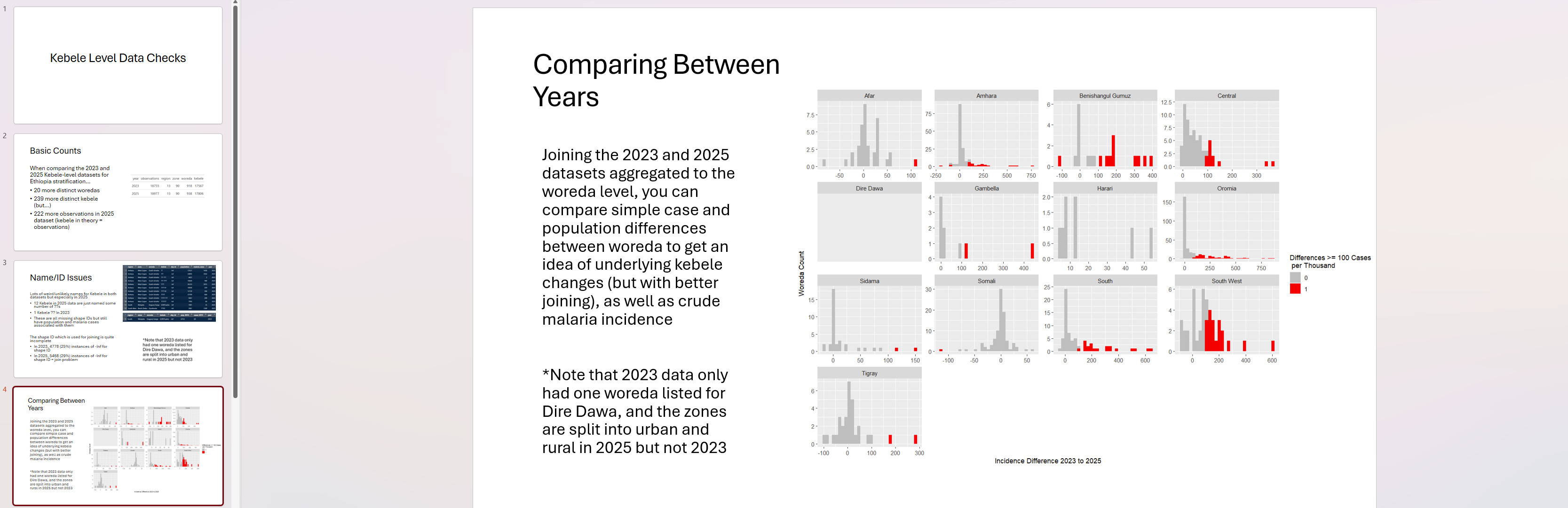
Create a companion powerpoint A good best practice for an exploratory analysis is to create a powerpoint at the very beginning of the process where you can chuck plots and questions to report out on as you go. These could be for you to share with your mentor, for yourself for own thoughts for later, or the beginning of a formal presentation you plan to make in the future. This companion powerpoint should contain your visualizations (saved legibly and with useful axes/titles) and allow you to narrate your findings as you go. The plots should be saved in a format that allows you to read the font in ggplot() (i.e. + theme(text = element_text(size = 16)) and with informative titles and axis labels. For each slide, try to include 1-2 plots maximum and focus on the “so what” of each plot. What should people think about when they see it? If you can’t define the narrative, it probably isn’t worth including in a presentation.
Here’s an example from an ongoing analysis of Ethiopia data. Can you tell from the image below what the key message was in this slide? Is there something you would change?
Specify your data In an exploratory analysis, it is common for datasets to be updated over time as new data are loaded or cleaned. Make sure that your script clearly labels each dataset as it is brought in, and that you know the relevant details about the data: - where those data come from (who generated them and when), - what the variables mean (this may require checking with someone), - what you want to do with them (your end goal or analysis question)
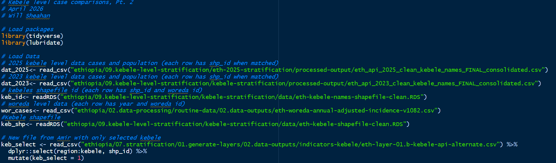
as you can see in the example above, I left myself a note for each dataset to explain key features and source information.
10.2.2 Initial scans
In this section, we focus on getting to know our dataset(s). In order to ask pertinent questions and get useful insights about our data, it is really important to understand their basic structure! Every time I download a dataset, I look at it first, and give it a visual scan. Let’s do that with the same malaria case data from Zambia that we’ve used previously.
To visually inspect data, you can use head(), View(), or just click on the dataset name in your global environment.
case_data <- readRDS("data/district-cases-long-scrambled.rds")

View(case_data)
From this, we get a clear picture of the dataset’s basic shape. It appears to be in “long” format, with a single Count variable that is categorized by Data Type at the district and month level.
If we want to know a little bit more about the dataset structure, the range and type of the variables we are seeing, etc. We can use a number of basic commands to quickly summarize this information. Try glimpse(), summary(), str(), or table() to learn about specific variables in the dataset. What are some interesting and relevant insights you can draw from this dataset?
HINT One recommendation is to not underrate the use of the table() command (especially if you use the useNA = “always” option). It can show you missing data, misspelled names, anomalous types, and more, if you think through the results carefully. In the example below, why are there different numbers for each province? And WHY are there 118 missing observations for it?
summary(case_data) period province district data_type
Min. :2018-01-01 Length:18172 Length:18172 Length:18172
1st Qu.:2018-12-01 Class :character Class :character Class :character
Median :2019-12-01 Mode :character Mode :character Mode :character
Mean :2019-11-09
3rd Qu.:2020-10-01
Max. :2021-12-01
count
Min. : 0
1st Qu.: 208
Median : 1588
Mean : 3914
3rd Qu.: 5393
Max. :53173 table(case_data$province, useNA = "always")
     Central   Copperbelt      Eastern      Luapula       Lusaka     Muchinga
        1737         1491         2294         1470         1061         1231
    Northern Northwestern     Southern      Western         <NA>
        1534         1671         2458         3107          118
10.2.3 Basic data cleaning
After getting an initial look at your data, you will almost certainly need to do some basic cleaning. In our context, the first level of data cleaning usually involves identifying and managing missing data, harmonizing geography names, and converting variable types. This can be an exhausting process, as malaria data are often particularly “messy” because they are reported from facility registers on an ongoing basis, oftentimes via handwritten forms that are manually digitized and imported into a system like DHIS2.
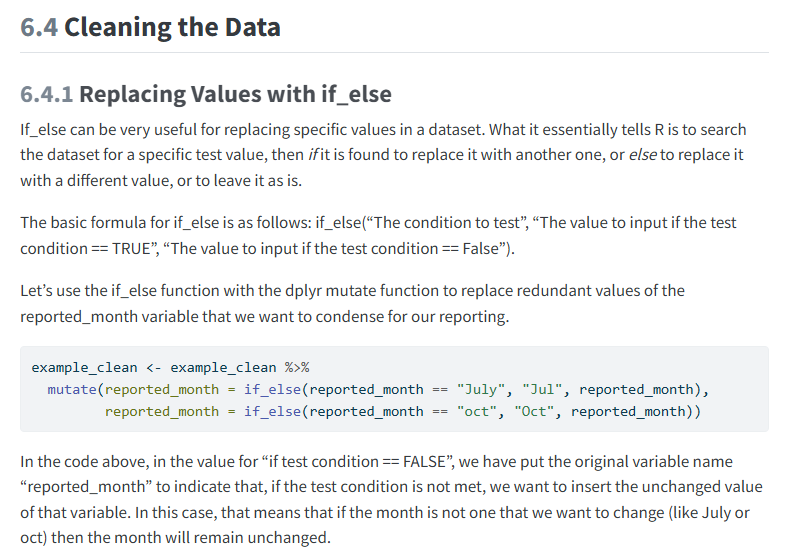
This process was originally discussed in Foundational R - Reading in Messy Data, and we won’t go into too much detail here, but some key steps to consider for each analysis are converting variable types as needed (making sure that numbers were read in as numeric data, not character strings), identifying missing temporal/spatial units (using table and count commands like we did up above), and correcting clear spelling issues. As an example, think back to how we used if_else() and case_when() to harmonize month spellings in Foundational R
10.2.4 Visualizing distributions and outliers
Once the low-hanging fruit of missingness and misspellings have been handled, it is time to focus on the slightly thornier process of visualizing and handling outlier data. This could be an entire unit by itself, and in fact, our next few units will be devoted entirely to different visual techniques you might use! This could include line charts, time series plots, and heatmap grids.
In this unit, we will focus on the basic premise, which is that we want to identify clear outliers or numbers that stand out and are not representative of the same trend as the other data around them. maybe the most basic way to do this would be distribution plots like histograms or boxplots. Let’s try looking at our district-level case data with these techniques. What do you notice as being immediately unusual?
case_data %>%
  ggplot() +
  geom_histogram(aes(x = count), binwidth = 1000) +
  facet_wrap(vars(province), scales = "free_y") +
  theme_bw()
For me, I would expect there to be some differences, as population sizes (and therefore case counts) vary both month-to-month and district-to-district. However, when we see very long and broken-up “tails” in histogram data, especially in the same geographic areas, it can sometimes be indicative of a problem. Let’s follow-up on the long tail in Northern Province with a boxplot and a lineplot to get a clearer picture, faceting by data_type to ensure we are comparing apples to apples.
case_data %>%
  filter(province == "Northern") %>%
  ggplot() +
  geom_boxplot(aes(x = district, y = count)) +
  geom_jitter(aes(x = district, y = count), alpha = 0.3) +
  facet_wrap(vars(data_type)) +
  theme_bw() +
  theme(axis.text.x = element_text(angle = 90))
It looks like many of our high values are coming from Kasama district, which may just have high case counts. But there is a pretty wide distribution of data (the “whiskers” are quite long) especially in the “Confirmed” category of data. Let’s look at a line plot to see how consistent these data are over time.
case_data %>%
  filter(province == "Northern",
         district == "Kasama",
         data_type == "Confirmed") %>%
  ggplot() +
  geom_line(aes(x = period, y = count)) +
  theme_bw()
There is a pretty huge spike in confirmed malaria cases in Kasama in early 2020, almost 1/3rd higher than the average year’s peak. Do we think this is an outlier that needs to be corrected, or just a very high case load in that time period? To determine the answer, it is important to know more about the context of malaria in Zambia during that time. We can ask a colleague or look for published literature from that period, but as a shortcut, let’s look at all of Zambia during the same period.
case_data %>%
  filter(data_type == "Tested") %>%
  group_by(province, period) %>%
  summarise(count = sum(count, na.rm = TRUE)) %>%
  ggplot() +
  geom_line(aes(x = period, y = count)) +
  theme_bw() +
  facet_wrap(vars(province))
`summarise()` has grouped output by 'province'. You can override using the
`.groups` argument.There certainly are other spikes in different provinces in early 2020, but at the province level, it seems that the rest of Northern had the same level of cases later in 2021, which was not the case in Kasama. Let’s add one other piece of context.
In order to have a confirmed malaria case, you need to conduct an RDT. This is a data element that we have access to (data_type == “Tested”). Let’s look at this together with our confirmed case data and see what it shows us.
case_data %>%
  filter(data_type %in% c("Confirmed", "Tested"),
         province == "Northern") %>%
  ggplot() +
  geom_line(aes(x = period, y = count, color = data_type)) +
  theme_bw() +
  facet_wrap(vars(district))
There was indeed a pretty huge increase in tests in Kasama in early 2020. This points to it being more likely that this was a “real” event, driven by an increase in testing rather than a data error. One last thing to check, we can calculate the Test Positivity Rate or TPR to see if the actual likelihood of diagnosing malaria with a test stayed constant or changed during this period. Let’s calculate the TPR variable and plot it out.
case_data %>%
  filter(province == "Northern",
         data_type %in% c("Confirmed", "Tested"),
         period >= "2019-01-01" & period <= "2021-01-01") %>%
  pivot_wider(names_from = data_type, values_from = count) %>%
  mutate(tpr = round(Confirmed/Tested, 2)) %>%
  ggplot() +
  geom_line(aes(x = period, y = tpr)) +
  theme_bw() +
  facet_wrap(vars(district))
While there was an increase in TPR in Kasama in 2020, it is not extreme, and actually is much less suspicious than some other districts in the same time period (Mpulungu, Chilubi). At this point, there is nothing to suggest that Kasama needs to be censored in our exploratory analysis.
This is just an example of the kind of process you will want to undertake as you explore a dataset and look for anomalies that could impact your analysis. It is worth noting that our dataset in this case has already been aggregated to the district level, and there are almost certainly some facility-level outliers masked by this aggregation. Whenever possible, it is best to conduct your analysis at the lowest possible level of the health system that reports disaggregated case numbers.
10.2.5 Investigate Trends of Interest
The next step for an exploratory analysis is to examine variables that relate to your research or analysis question. For example, if you want to see how cases change over time, you could plot cases or incidence at the district level with a time series plot. Or if you wanted to determine the relationship between cases and something like temperature or rainfall, you would want to join those external data to your existing dataset and plot the two in concert.
Let’s take the example of rainfall, which is commonly associated with malaria.
district_rainfall <- readRDS("data/Zambia_rainfall_20_23.RDS")Use the same steps from earlier in this unit to examine the rainfall dataset. What columns are we working with? Where do you think we could perform a straightforward join, and what data will we be gaining and/or losing? You may find it is most straightforward to summarise the data_type variable into one “total_cases” metric, so that your case data can be joined 1:1 with your rainfall data. This is a reasonable step because we don’t expect rainfall to show a trend that is different between different case data types.
After joining the data, you should now have a monthly district-level dataset with both total malaria cases and total rainfall. Examine this dataset and look for missing data. What is the source of this missingness? Is this something we can correct for?
Once you have identified and handled missing values, a good next step is to create some simple correlation plots with your two variables of interest to look for potential associations. These can start as scatterplots or similar bivariate comparison plots. Here’s a website with some helpful R code for bivariate and multivariate comparison visuals https://rkabacoff.github.io/datavis/Bivariate.html. Think about how you might want to use color or shape to differentiate your points, and don’t forget about using facet_wrap() to separate your plots into groupings that are easier to visualize.
Now a simple scatterplot doesn’t tell us a whole lot, except that generally, months with more rainfall seem to have more malaria across the different provinces in Zambia. If we want to know more about the data, we are going to have to get more creative with the questions we are asking, and the techniques we use to visualize them. For your own datasets that you work with, think about what unanswered questions you might have, and use this unit as an example to start interrogating those questions using your R code.